Angelica Mesiti: Relay League
Seoul, Korea. 2018 Design by Hey Joe
Alberto Arlandi,
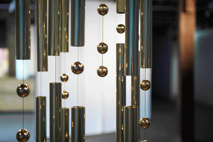
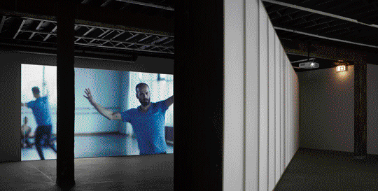
A three-channel video installation with sculptural counterpoint: Angelica Mesiti’s “Relay League” is about language and human’s desire to communicate. The Seoul–based graphic design studio Hey Joe developed an identity for this touring solo exhibition that opened at the Artsonje Center.
From the editor's desk
The exhibition reflects upon the overabundance of mass communication in today’s environment. As we progress towards a society obsessed with the consumption of images, sounds and gestures of communities, the spontaneous non-verbal communications of humans are lost. Besides the actual design project analyzed in this critique, the theme itself of the exhibition is something interesting for designers as well.
The initial idea of the artist starts around the last message transmitted by French Navy in 1997 using morse code before switching completely to digital communications. “Calling all, this is our final cry before our eternal silence”, apparently a quote by the philosopher and mathematician Blaise Pascal, although no confirmation of this was find at the time of writing this article.
Regardless of the actual message, Morse, a fixed code of intermittent long and short bursts of sound or light, represents a relationship between verbal and non-verbal communication. “The identity of exhibition started simply from taking shapes of Mesiti’s sculpture which is a formation of Morse code. This form of morse code was used in variations.” comments Hyoun Youl Joe, revealing a design approach that starts from the available content and develops from that.
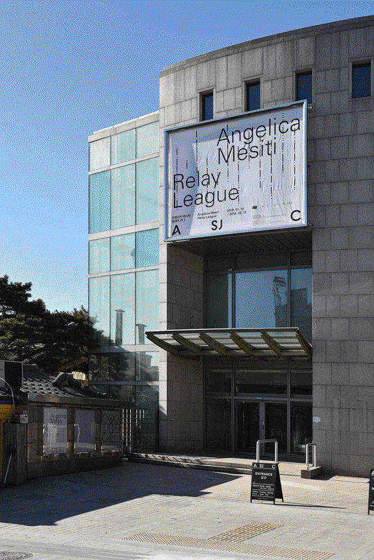
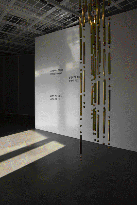
The posters always show a pattern of dots and lines vertically aligned. On every material, spread across the width of the available space, the sequence reads “Appel à tous. Ceci est notre dernier cri avant notre éternel silence”, which is the original french message transmitted back then.
The title of the exhibition and the name of the artist, set in Univers, are placed above these patterns, and nothing else. Given the bare simplicity of the composition, care for details and the reason of their existence becomes essential: that is what sets apart a work of design from dry minimalism. On a formal level, one can note perhaps the inconsistency between rounded dots in morse code and square dots above “i”s. However, the layer of meanings that each of the few element holds appears to be carefully calculated.
The asymmetric position of the text is also reflected at the entrance of the exhibitions, although Hey Joe didn’t take care of the space design. A suggestion of movement between the vertical lines is perhaps created with this layout, not dissimilar from the artist’s willing to allow visitors to interact with the metal sculpture as a big wind chime.
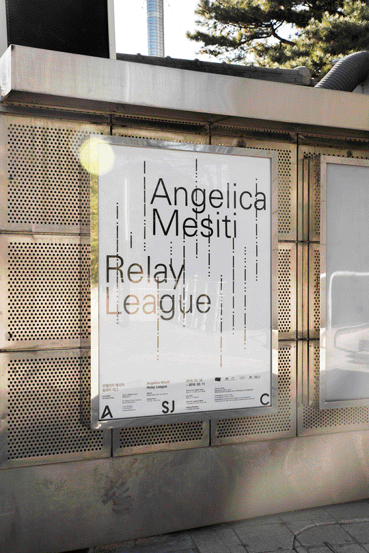
“Verbal language visually appears only on the exhibition title. The graphic identity focused on the shape of ‘Morse Code’ which is important communication element of the exhibition”. Thus a single element defines the identity, and instead of being a mere decorating device, it makes perfect sense within the theme of the exhibition.
As basic as a primordial communication can be, only pure black and white is used. The morse code can be recognized only by the difference between light and shadow, sound and silence, just like black and white. Not adopting any color or any special inks here was the most appropriate choice. For an exhibition that reflects upon the bulimia of brightly colored pictures we see around us, creating yet another chaotic piece would have been unsound.
“We prefer to work as elaborating the concept of the exhibition.” summarizes this subtle approach that doesn’t overshadow or hide the work exhibited, but offers a different point of view to the public. Coming from South Korea, an interesting take on the subject matter of designing posters for art exhibitions.