Antwerp Art Weekend
Antwerp, Belgium. 2018 Design by Vrints-Kolsteren
Michael Klein,
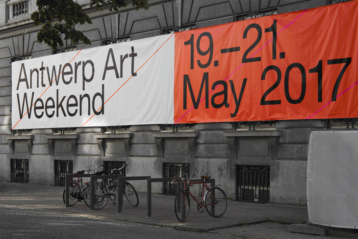
Antwerp Art is an organisation that connects the most relevant actors in the Antwerp contemporary art scene: from established galleries and museums to upcoming initiatives. Every year they organise Antwerp Art Weekend, an event which combines talks, performances, programmes, book presentations and parties to bring together Antwerp's contemporary art scene. For the third year in a row, Vrints-Kolsteren have been tasked with designing the identity program for the event.
From the editor's desk
«Antwerp is totally taken over by the art scene for one weekend», says Naomi Kolsteren, who has founded the eponymous studio along with Vincent Vrints. «We started out doing the first Antwerp Art Weekend and gradually were asked to do all their visual communication as well as a new visual identity. The first year we were only asked to make a new design for Antwerp Art Weekend, but because we wanted them to have some consistency in all their communication, we started to build a system that could work for them for longer that just one event. And that ended up becoming their new identity.»
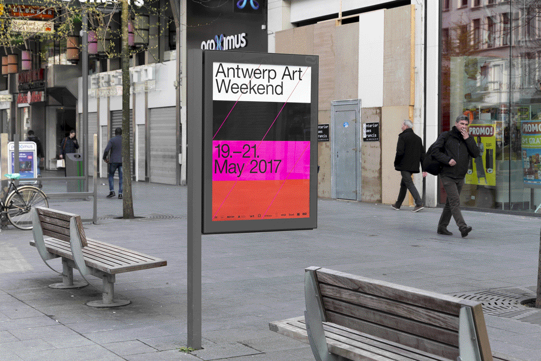
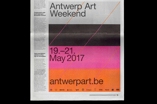
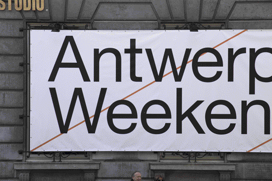
Throughout the identity for Antwerp Art Weekend and its implementations there is no single sign-signifier, no unique image to orchestrate the rest of the elements in syntactical coherence obtained through repetition of the same scheme. Rather, Vrints-Kolsteren have employed the idea of a system (coherent in its diversity of application modes ruled by an holistic principle, rather than repetition) and have done so to a great effect.
«We really wanted to create a dynamic system and not just a static logo, like most institutes», says Naomi, «because then it would become another institute and we wanted it to be more like a platform». This reasoning is particularly suited to an identity that will be used to represent an extremely diverse array of artists and ideas, as the system in itself is built to generate diverse outputs instead of constraining all the content within a strict norm. Such a system, however, could easily run the risk of overwhelming the content with its own presence in the effort to create a strong identity. To counteract this risk Antwerp Art Weekend has been designed calling upon design fundamentals of surface, line and color. No voluptuous gestures are needed in this context, and the balance that the identity strikes makes one suspicious that such gestures are hardly ever needed in general. The achievement of balancing identification and flexibility by such humble means is not to be discounted. Simple stripes of surface rendered in bold colors (different every year) are paired with diagonal lines and big, neutral typography to ensure legibility as well as a hospitable framework for different kinds of art.
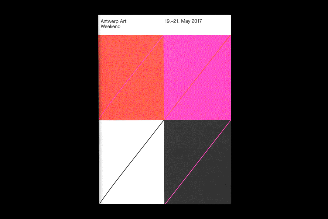
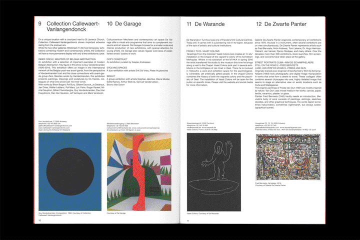
«Every year the members of Antwerp Art are collected on a map called the Antwerp Art Index. We wanted to keep this idea of a map as a base, so that is where the idea of the architectural lines came from. The identity is based on these dynamic lines that make the words AA(Antwerp Art) and AAW (Antwerp Art Weekend). They are used in many different variations throughout the different items» explains Naomi. «We wanted to create a very neutral identity by using neutral typefaces like Helvetica and Times. We felt this was important [to provide a framework for] all the art organisations. This gives us room to go for bold and vibrant color combinations, so the designs will really stand out in the streets.»
The end result, however, escapes the perils neutrality. It certainly involves neutrality as much as it's necessary not to suffocate the delicate subject matter that art is, but in the end it achieves a far more difficult balance than it could be done by aiming for pure neutrality. Often sterility and formalism are concealed in the name of neutrality. It is definitely not the case here, and certainly part of the credit for having been able to achieve this result in a contemporary landscape of graphic design afflicted by congestion and last-minute trends goes to an intelligent client.
«A friend of us, Benny Van den Meulengracht-Vrancx, is co-organising Antwerp Art. We studied together and know each other well. He trusts our judgment and that is why working together is so pleasant» clarifies Naomi. This is an aspect that we as a publication feel the need to stress ever more so in the current Internet paradigm that bombards curious designers with imagery of solutions devoid of any context, let alone behind-the-scenes of the relationships between clients and designers that are so critical to how a certain project will end up looking like. Beside being a remarkably well designed solution, Antwerp Art Weekend also reminds us that there is hardly ever good design without good clients.