Artek Helsinki
Helsinki, Finland. 2017 Design by Tsto
Michael Klein,
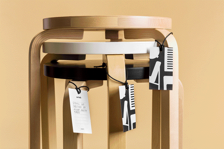
Co-founded by the great architect Alvar Aalto, the finnish brand Artek has managed to remain relevant for over 80 years. Engaged in a mission of “promoting a modern culture of living by exhibitions and other educational means”, the brand still ranks among the finest producers of modern furniture. Artek approached studio Tsto to design the visual identity for their new store in Helsinki.
From the editor's desk
The intriguing tautology of designing for the design industry always poses designers an interesting question: when does design become self-referential? This is particularly true of designing identities for design brands. One only needs to take a walk down a few of the many oversized pavilions at Milan's Furniture Fair to notice how many brands seem more concerned about communicating an idea of design – often a reflection of their own, subjective views – or keeping up with some ephemeral trend rather than focusing on their products and what makes them unique by virtue of the values that we hope exist in the first place.
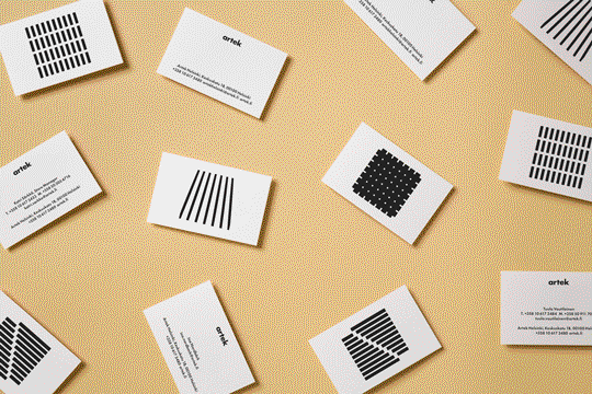
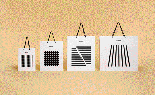
This isn't the case with Artek. To this day, the brand (owned by Vitra, who in the past has worked with great graphic designers the likes of Pierre Mendell 1 ) has remained consistent with its founding values — something that is still reflected in their straightforward and honest identity. Studio Tsto was confronted with the task of playing around the cornerstone elements of Artek's identity while creating something new; to accomplish this they created a series of pictorial elements borrowed from the shapes of Artek's disassembled furniture, arranged in different square-contained configurations each time. This device is as simple and pragmatic as Artek's timeless furniture, works quite well with the existing elements of the identity and strikes a perfect balance between identity and diversity.
The colour palette is reduced to the bare minimum (black and white) allowing forms to take center stage in the communication, with no further visual distraction. This scheme is applied across all sorts of printed materials.
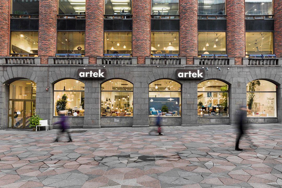
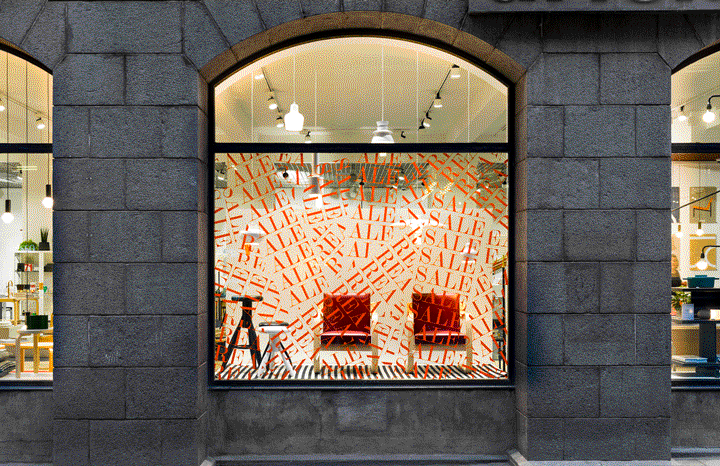
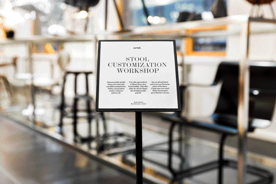
Furthermore, Tsto has introduced a neoclassical secondary typeface to accompany Futura. Even though this contributes positively to the contrast and elegance in particular pieces such as displays and wayfinding, we feel it's a bit heavy-handed when considered in the broader context of Artek's existing identity. It's important to note, however, that these applications are conceived specifically for the Helsinki store and as such don't constitute an hindrance to consistency at high level applications of the parent identity.
On a broad look, the identity is appropriate and accomplishes its purpose of working with the existing elements while being tasked to solve a specific problem. Going back to our original question, Tsto's solution is clearly not self-referential and as such does deserve praise in a context – that of designing for design brands – that quite often is.
-
1
Pierre Mendell Design Studio, Vitra. (mendell-design.de)
↩︎