Ben Vautier
Basel, Switzerland. 2016 Design by Büro 146
Michael Klein,
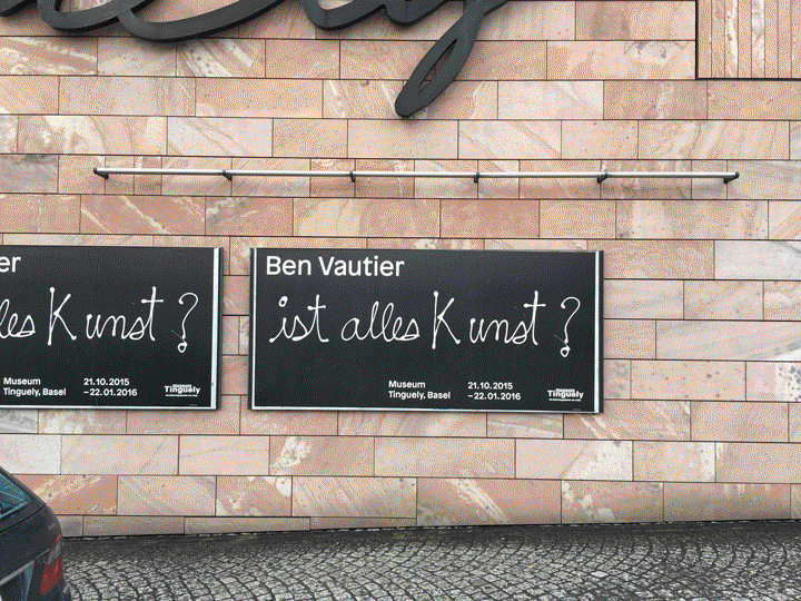
Last year the first ever extensive retrospective to show Ben Vautier's work in Switzerland was held at the Museum Tinguely in Basel. A book was also designed and produced for the occasion, published by Kehrer Verlag. Design studio Büro 146 was retained by the museum to design the identity and book for this major exhibition.
From the editor's desk
Designing for Ben Vautier is no easy business: artist, performer, pioneer of the Fluxus movement, art philosopher and theorist, the French-Swiss octogenarian dean of the art world has been known for his provocative statements "L'art est inutile" and "Je suis le plus important" ("Art is useless", "I am the most important") which he himself has challenged for nearly sixty years, and for his calligraphic statements which "with short, concise sentences, challenge and challenge again life and art".
«The material, the colours and the bold use of typography are inspired by Ben Vautier's Fluxus posters from the 60s» explains Valentin Hindermann, a partner in the studio. Vautier believed that a work of art can only be recognized by a signature, which is nothing but a certain arrangement of letters — a typographic statement that creates identity. Büro 146 works within the tradition of Swiss Typography; their penchant for restrained typographical solutions and the choice of typography as the most prominent instrument employed to convey meaning results most appropriate.
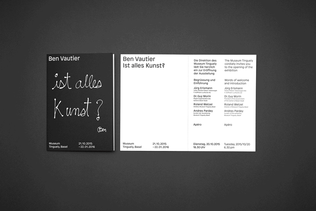
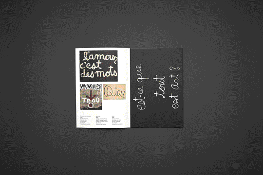
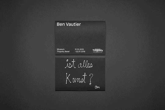
Sometimes the designer has to work around constraints that are set by the client. «Ben's own caption 'Ist alles Kunst' was the key visual for the whole identity preset by the museum. We didn't have much alternatives there» elaborates Hindermann. Nevertheless, the final solution incorporates this requirement so elegantly that one would never suspect it was a constraint in the first place. In the promotional printed material, the typographic setting around Vautier's caption is powerful and subtle at the same time: while never taking center stage it is able to reinforce the signature -the sign that the artist regarded as identifying- while simultaneously making it prominent. Although the museum might have been better off resisting the idea of putting their own logo on the brochures at the expense of the design's integrity (after all, the museum's name was written in big letters), the printed ephemera comes across as cohesive. A functional hierarchy is established and articulated through a clear structure. As in any good design for art exhibitions, it is understood that the intervention of the designer is intended to present the content in the best way possible, not as a vehicle for the designer's ego. The tension between form and content might have troubled Vautier himself, who later in life switched from the imposed formal expression to a focus on content and meaning.
Looking closer, the designers' generously dimensioned typography also shows a peculiar fact: the selected typeface has such a tall x-height and nearly even proportion between lowercase and uppercase, that it almost evokes the artist's own thick, oversized handwriting. «We didn’t want to work out a retro design. Rather, we tried to transform some of the aspects to a contemporary expression. We decided to use the typeface 'Patron' by Timo Gaessner, a grotesk typeface inspired by Roger Excoffon's font Antique Olive» explains Hindermann.
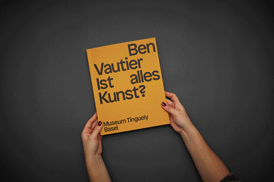
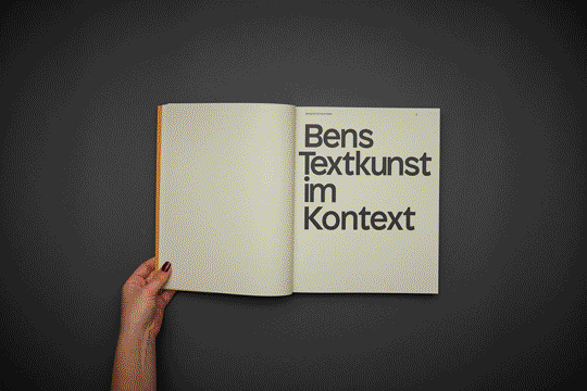
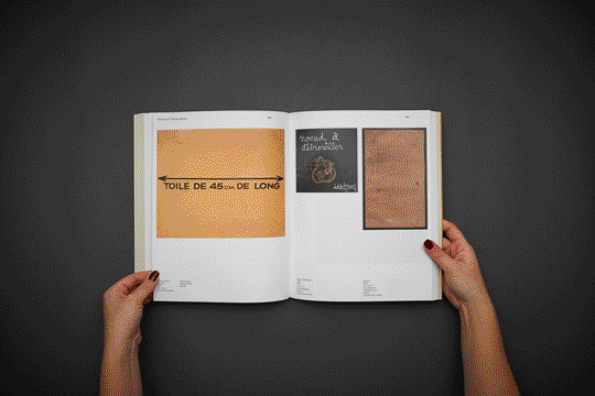
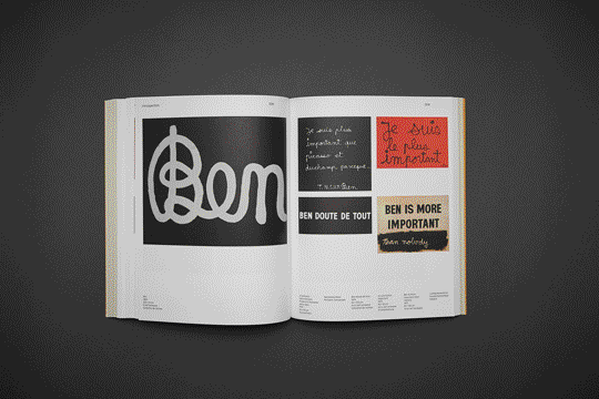
The catalogue introduces the only note of colour (yellow) that is perhaps confusing in the dominant purity of black and white, but doesn't hinder identity. The street level communication is quite powerful and it accomplishes its role of drawing people's curiosity about the event.
In its entirety, the identity is an exceptional example of communication for art. As intertwined as art and design can get in some contexts, the mutual relationship and role of each other is here clearly defined according to the context. With masterful skill, the graphic design is able to make the content shine with the same economy that pioneer El Lissitsky advocated for any solution, while being itself a carefully considered act.