Betevé
Barcelona, Spain. 2017 Design by Folch
Alberto Arlandi,
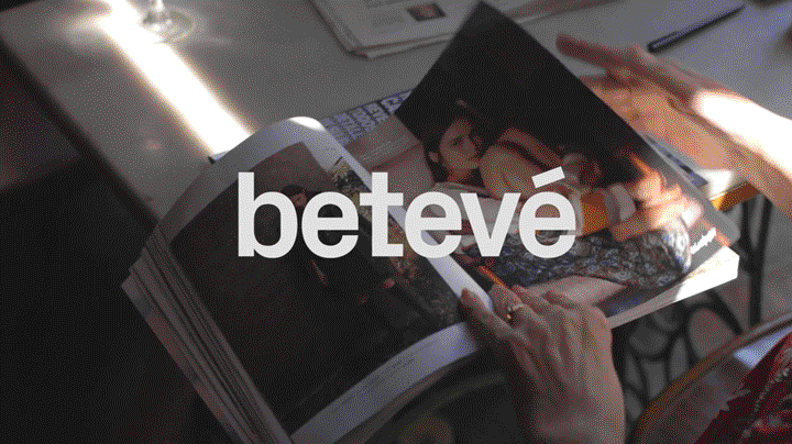
Barcelona Televisió is a local TV channel born in 1994 that covers the metropolitan area of the catalan city. Four years ago a big transformation started to turn the small traditional channel in a “transmedia service” resulting in a comprehensive visual and conceptual overhaul in 2017 thanks to the clean work by Folch.
The rebirth of Barcelona Televisió matches a much wider wish felt by the spanish inhabitants: changing the perception of the city, rediscovering the peculiarities of Barcelona outside its well-known landmarks. The “mirada imperfecta” (the imperfect look) is the main concept behind the whole identity: Folch explored the reality of normal people, the everyday life in order to give shape to a service for the common citizens, the real end users of this channel.
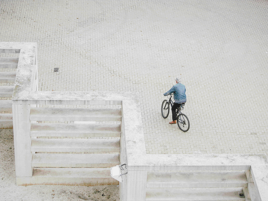

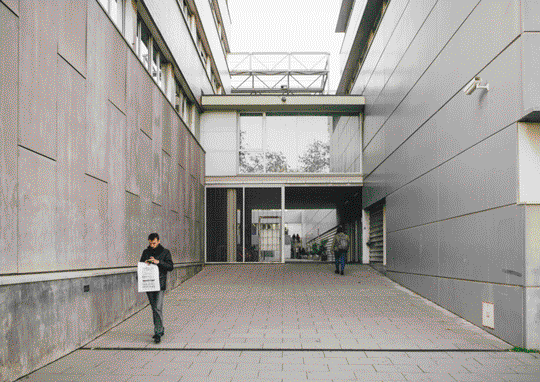
Such devotion to the city coming to life through graphic design is a good example of a large-scale operation addressed firstly to the customers that, at a later time, may even become commercially successful. On visualizing this call to the citizens, Folch explains that “The lower case letters conceptualises the accessibility, the interaction, usability and simplicity that the new brand stands before. betevé is a part of the community and unifies without use of capitalisation.”.
Yet, as “betevé” was surely a spanish nickname given to BTV, it’s worth noting the loss of both the clear reference to “Barcelona” and the medium “TV” from the official naming. The new identity is not only about a name or a logo: the transformation is far deeper, involving the creation of a multiplatform reality where the content creator is trusted and recognizable whatever medium is used. “There is a deterioration of the television environment in the face of new technologies .. It is necessary to apply the design thinking and to rethink the whole strategy and the speech of the brand”
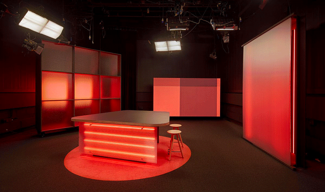
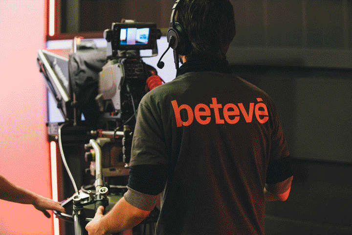
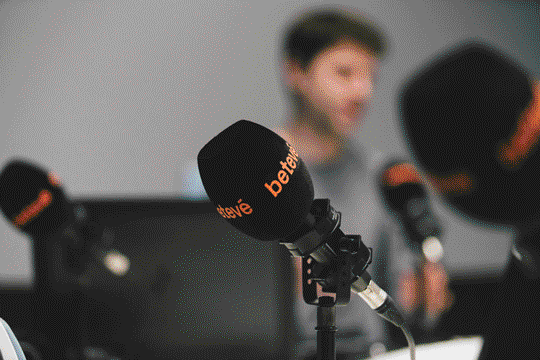
Colors, photography and animations play a big role in this project to unify web and television not under a logo but under a unique personality. Consistency is a rare sight in lots of national channels, and while it would be nice to have even more coherence between the TV container and its shows, the direction and vision of Folch is clear even when coordinating collaborations with lots of other studios and individuals for photography, motion design, interior design and music composition. However, while the transversality of media and content is a big step forward for a TV channel to be relevant today, anonymization is a concrete risk when promising a kind of international-looking “brand” and abandoning “localism”.
The strong focus on animated typography and photography calls for a pleasant typeface to see and read. The decision to use Optimos’ Px Grotesk 1 by swiss designer Nicolas Eigenheer results from the objective “to find a typography sufficiently characteristic to be a differentiating element, but at the same time consistent and suitable to be used exclusively in all applications of identity.” If the excessive simplification of curves (lowercase “t” and “r” for example) feels sometimes odd to read, the contemporary geometric typeface surely defines a strong identity. Only time will tell about longevity.

“We had to decide whether to accept the brief as it was or to confront it, in order to make them understand that the channel had to be rethought from the core” says Rafa Martínez, COO and partner at Folch. Hopefully betevé will continue to strictly adopt the system designed by Folch, maybe even extending it to new platforms and programs. At the moment, the project is already a good demonstration that adopting design thinking through content and form instead of just embellishing the surface is the best move for a company that strives to survive today.