Catseye Bay
Sidney, Australia. 2015 Design by SP-GD
Michael Klein,
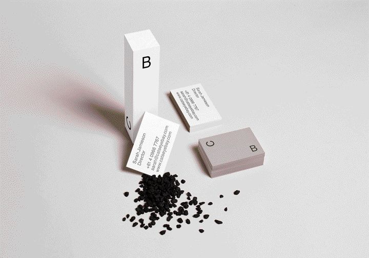
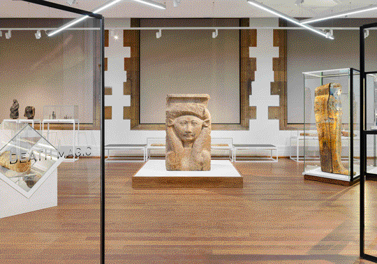
Catseye Bay is a spatial design studio based in Sidney, Australia, whose work spans from interior design to exhibition design and creative direction. SP-GD was retained to design their identity, website and associate materials. From the case study: "We created a system that would adapt to its media and format. The Identity was created loosely on the action of floating between two sides of the bay. The distance between the two letters are adaptable to their media, creating a versatile relationship of space and form."
From the editor's desk
The ability to handle space is at the core of any designer's skillset, and one that the designer who wishes to achieve full mastery over its materials must be willing to perfect. Whether the work is in two or three dimensions, physical or digital, as soon as two elements are placed in a given space, certain relationships are immediately established. Sometimes questions of scale, proportions and balance are just accessory to bringing an idea into fruition. Some other times they are the only element of identification— one might avoid strong concepts in favor of relying on the expressive values of typography and spatial choices to convey meaning.
SP-GD have managed to strike a functional balance between these two archetypes with their identity for Catseye Bay: the concept itself (achieving identity through spatial manipulation of the company's initials) is rooted in visual exploration and couldn't be expressed otherwise. Two basic sans-serif uppercase letters that would arguably accomplish little identification by themselves, achieve their goal the moment they are linked in syntactical correlation by space — the very subject matter of Catseye Bay's activity. This 'visual logic' effectively separates the project from a great deal of dull identities that in the past few years have mistaken hip typography for something that is enough of an identification medium by itself.

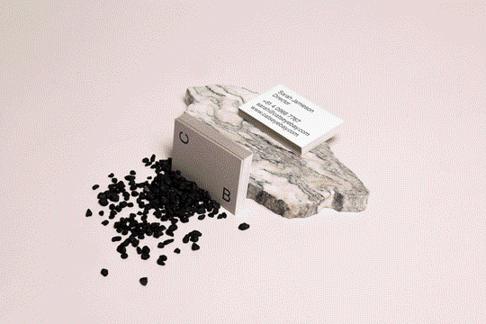
As the initials are correlated by space, they also establish an interesting mechanic of flexibility: they can be moved around according to the surface, rotated and repositioned while not breaking the identity. As it's often not so surprising, pioneering work from modernist designers had already paved the way for this approach. As early as 1959, swiss designer Karl Gerstner had come up with a solution that in present-day language we'd call a "responsive identity" for the vinyl records shop Boîte à Musique. Eschewing the notion of communication by a systematically repeated appearance, Gerstner explained that he was more interested in his identity being remembered for something less tangible. 1 By doing this, Gerstner effectively got rid of the logo as a monolithic presence, highliting the importance of visual experience.
The influence of this line of thinking is clear in this and other similar projects and deserves recognition.
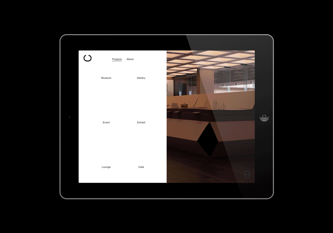
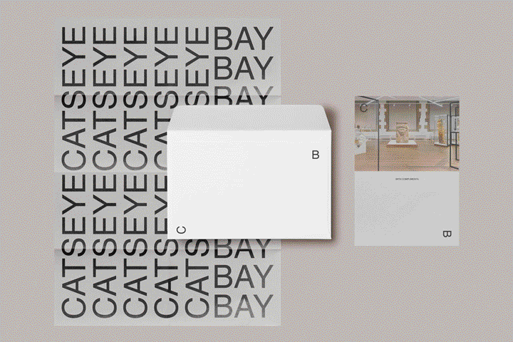
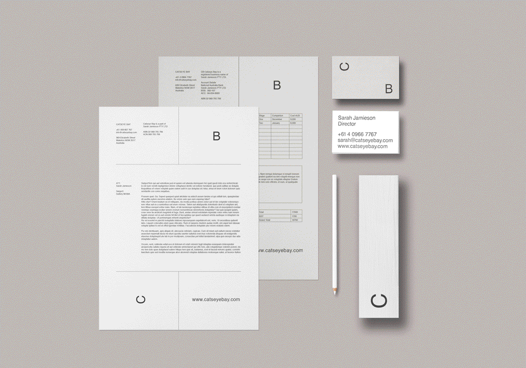
The identity is well declined and consistent throughout its applications. If something more could've been done in regards to the website and how it works within the ideas we have expressed so far, the project ultimately succeeds in communicating Catseye Bay and the scope of its activities. It is functional, unique with utmost economy of means and appropriate to its context, which are all things we should never forget the importance of.