Feeld
London, UK. 2016 Design by Two Times Elliott
Michael Klein,
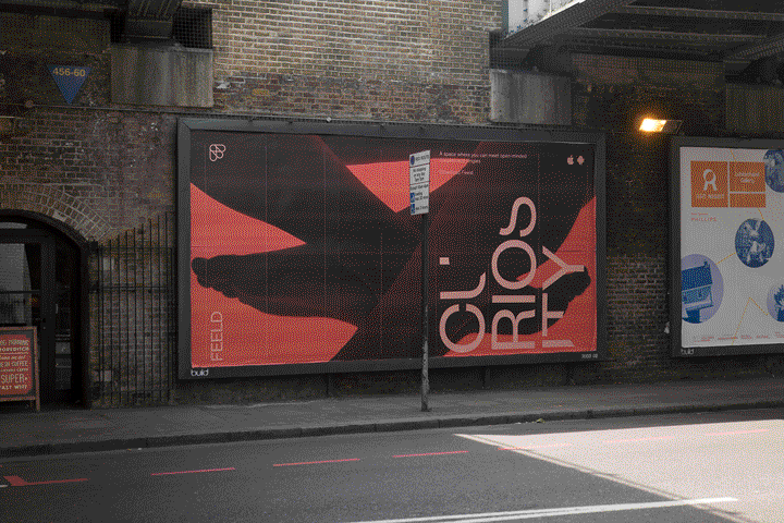
Feeld, formally 3ndr, is a dating platform that can be explored freely, openly and without limits. The app's focus is to bring together like-minded individuals that wish to explore their sexuality or just talk to others that may be confused or unsure of their preference. London-based Two Times Elliot were commissioned to rename, reposition and rebrand the app.
From the editor's desk
Dating platforms are no news. Long before the heyday of Tinder, several options were available for people looking to meet somebody, but virtually all of them were marketed along the lines of a promise to find you a partner. None of these platforms did a good enough job to make people feel sufficiently comfortable to admit they were just looking for sex, let alone people admitting a wish to explore their sexuality outside of the commonly perceived boundaries of morality.
This issue is extremely interesting for designers because at the hearth of it lies a design problem: the way people perceive a product or service that has something to do with sex is highly volatile and deeply dependent on good communication. Those who feel embarassed by just imagining to walk into an adult store and ask for a sex toy will be surprsed by the openness that you can find on Feeld: there are many young couples listing interests such as 'BDSM', 'Threesome' or 'FMM' (female-male-male) who declare to be open to all kinds of exploration —whether it's team or solo.
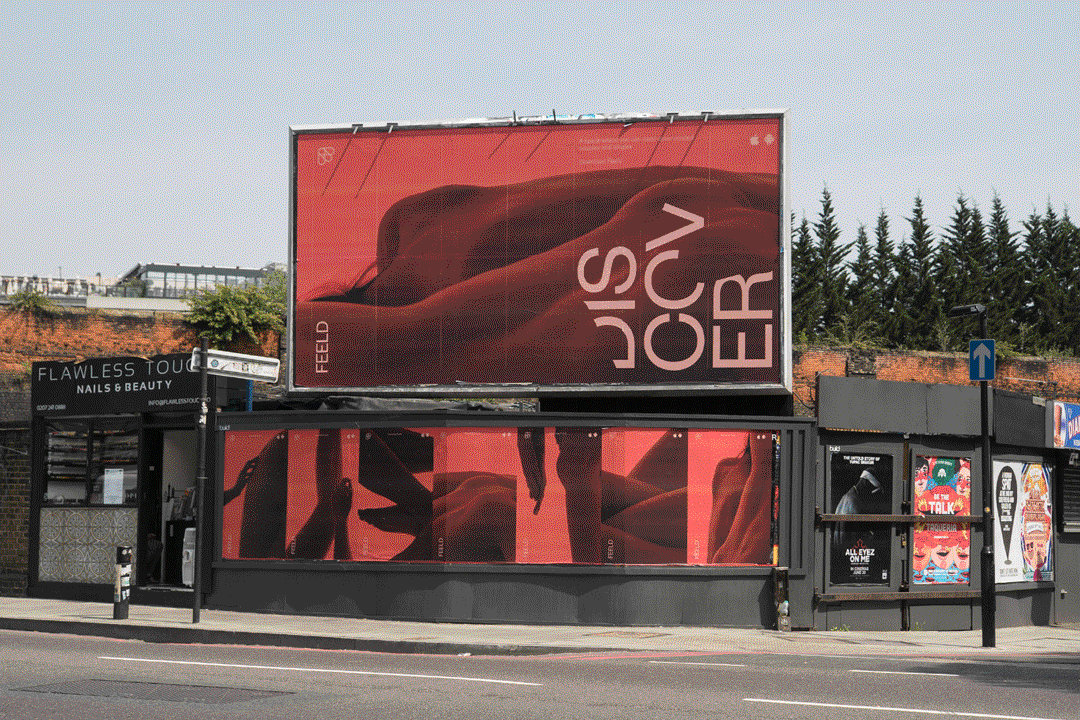
"We were approached by the founder to rename, reposition and rebrand the app with the focus on moving away from previous associations with the app, namely its ability to bring three people together, and to look instead at the freedom it offers and the communities it’s looking to build" explain Two Times Elliot.
"Our response is organic, based on the notion of exploring and roaming, with the name inspired by Italian ‘campo’ (courtyards that small passage-ways spill out into create spaces for local communities to come together), a word that’s english translation is ‘field’ (an open area). For us, and the apps founders, the name encapsulated both the community-spirit, and the open nature of the app."
The resulting identity is nothing short of a masterclass in the relationship between semantics and design. The articulation is deceivingly simple: a shade of red that is just right enough not to fall in the stereotypical range of reds associated with passion envelops everything; a most generic neo-grotesque typeface rendered in lightweight letterforms and carefully considered photography (the centerpiece of the identity) complete the tryptich. The only interference with this carefully balanced act are the arbitrary cuts in the letters, that even though are a reference to the logo feel like a nuisance rather than a necessary element. Notwithstanding this detail, everything is designed to render the subject in a way that effectively cleanses sexuality of all previous cultural stigma, getting to its very root: discovery and contact between humans, elegantly rendered in visual form.
"3ndr was an application built on the premise of multiple partners yet no real emotive response to the core brand story. Our approach and rationale behind the imagery was to create a strong essence of sexuality without the existing notions of what 3ndr stood for. We looked to embrace the human form and the importance of intimacy but carefully treading the line of overly sexualised photography. Feeld, at its core, is a place where like minded individuals come to build relationships, whether intimate or purely platonic - a place where you are able to be part of a community; a place where you feel as though you belong" the designers continue. "Across the identity the visual language is fluid with the intention that it is always more focused on being sensual, as opposed to sexual. Our approach was always set on making people feel comfortable around the app."
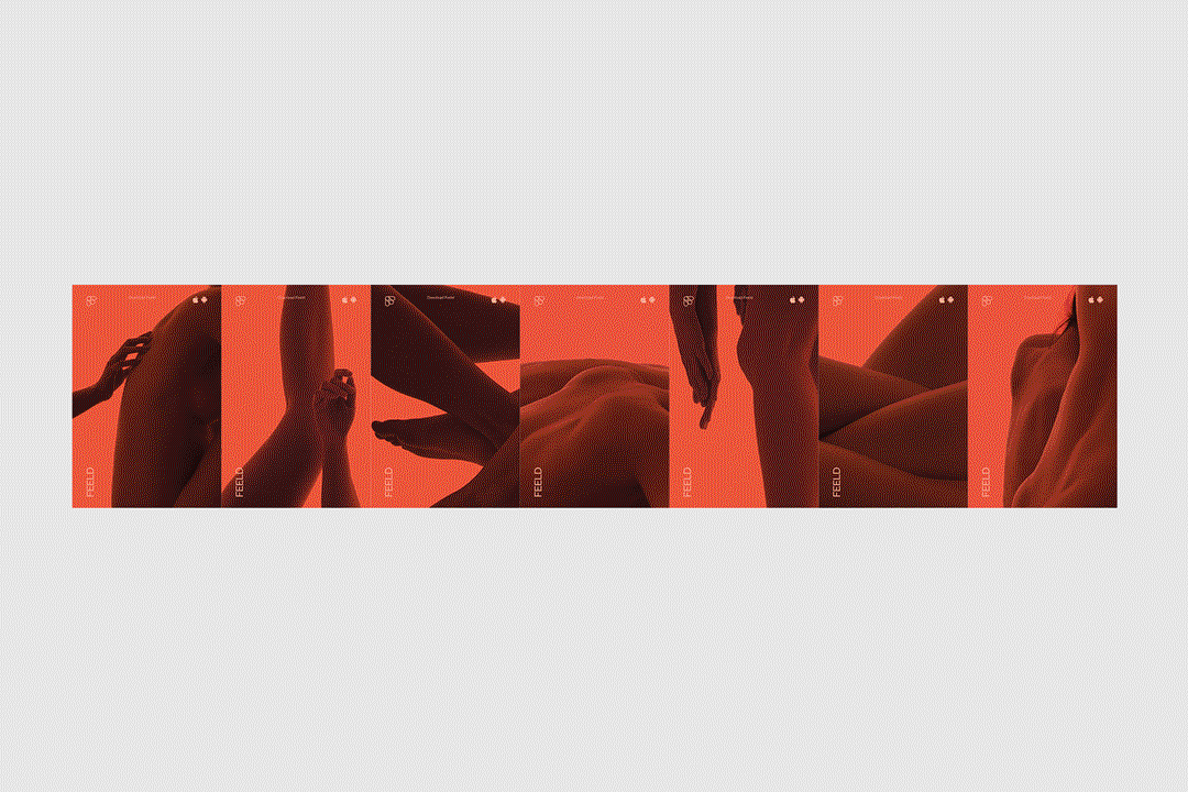
This essential approach is carried on in the mobile application, which features simple interactions and a pared down design. Overall, the design feels like a prime instance of the approach that Two Times Elliot have exhibited many times in their body of work, and always successfully so.
"Our overarching visual style and belief within the studio is a reductive one; removing visual noise and allowing all elements on a page to shine and be there for a purpose. Using Feeld as an example, we created an identity that brings character to each of its defining elements whilst being considered enough to work together with other elements within the visual toolkit."
The richness of semantics that Two Times Elliot have achieved here while constraining themselves within the most simple boundaries reminds us that good simplicity, as opposed to false, formalist and trendy incarnations of 'simplicity' is not a style, but a logical territory ample enough to solve any communication problem with elegance, as opposed to vulgarity and the brutalization of form. Considering the sexually-charged context of this project, it is even more telling.