Readability of the letter o
Torino, Italy. 2017
Alberto Arlandi,
As humans, we have evolved with a strong economic principle in mind: the lesser the effort required to achieve something, the better. That is true in every field in which mankind has discovered something, and reading makes no difference as we developed typography through the centuries to decrease eye strain and to speed up the process of gaining information from printed matter.
Words and letters are also the result of another kind of functional evolution: handwriting. This simple principle of economy had in fact a strong influence on the shapes we now recognize as a language: we learned to abandon complex forms that were slowing down writing, perfecting those that were easier to understand in a very few strokes of brush.
The widespread of printing techniques didn’t stop this process: the influence of calligraphy during the slow shift to print is extremely clear in the works of the first famous typographers. Not only the old style serif types bear strong features of hand lettering (diagonal axis, different stroke widths and so on) but Gutenberg’s famous 42-line Bible –what we now commonly consider the beginning of print– was created to faithfully resemble the product of an artisan. To mimic the nuances of handwriting, Gutenberg adopted a set of 290 master characters, including ligatures and different versions of the same letter, narrow or wider.

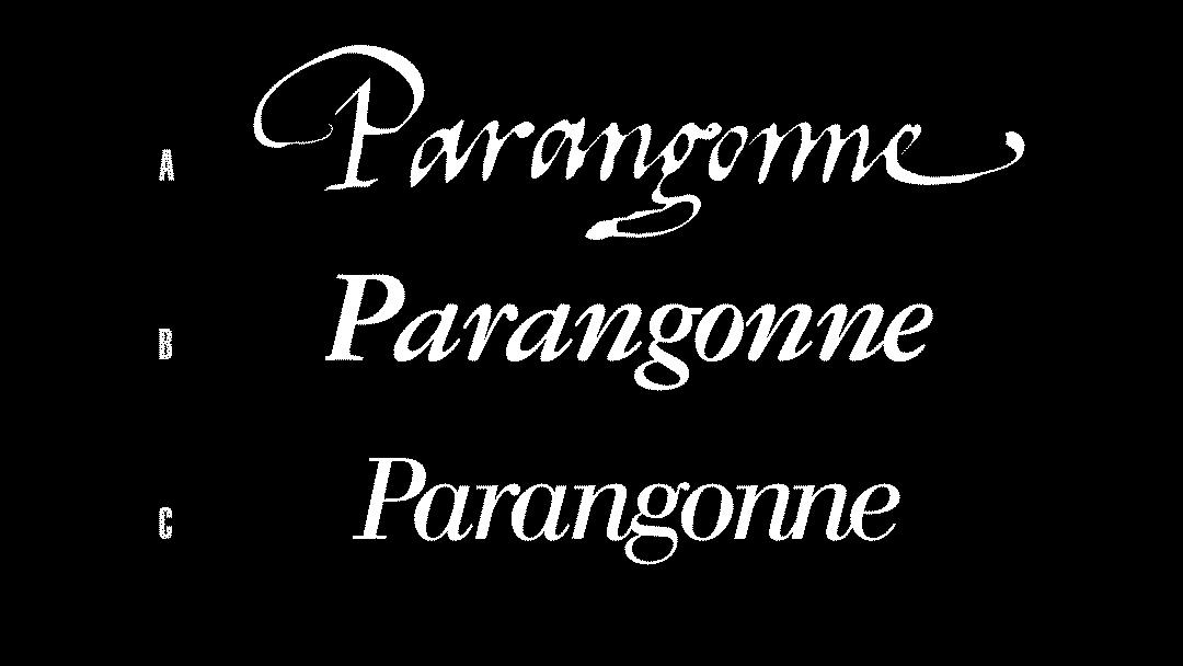
To put it simply, a big chunk of the types we have today at our disposal originate in one way or another from pen and ink. Then there’s the other fraction, the “drawing board” types. When looking at famous serif types, especially the italic ones, the resemblance to a handwritten text is clear but differences in approach (Garamond and Bodoni shown here) are quite subtle. Instead, the contrast of attitudes becomes more evident when analyzing sans serif typography.
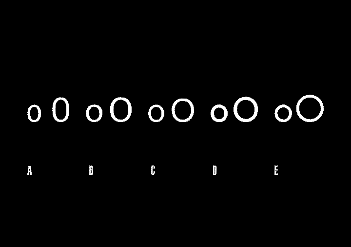
We’re going to use lowercase and uppercase letter “o” as visual reference. The comparison shows the progression from a sans serif extremely rooted in the idea that typography should reflect handwriting, to one conceived believing that the primary forms of circle, triangle and square were the best reflection of the new machine age. On the right side, also a famous contemporary typeface, representing the recent resurgence of geometric sans serif.

The term “drawing board” refers to the fact that Paul Renner started from a pure idea of a typeface based on geometric forms. “Characters are forced into a strict set of rules” as Ian Moore points out on Typographica. 1 Surely the eye can recognize the single letters, it can even understand the most creative script and Futura is actually very simple, but the extreme width of the characters (and the fact that they require a good amount of white space in between) alters the standard reading rhythm.
While reading a text, the field of view of the eye is very limited, as it reads phrases in groups of few letters. The economic principle still holds true: the less movement the eye has to make, the better. However, with very wide characters the scanning process requires quicker and longer motion: we’re simply not accustomed to this, given that centuries of comfortable handwriting resulted in more compressed shapes. The overall flow of the words is another key factor to take into account: the eye follows the continuos movement and inclination of the hand. In this respect, italic serif types are the best at pushing the reading forward, whereas primary shapes look very static.
At this point, one might think that geometric typefaces are simply not readable enough to be adopted or that they require an endless amount of optical adjustments to become readable. But while the formal approach of these kind of typefaces creates circles instead of “o”s, forcing the eye to read one letter at a time may be a design choice in a particular context. It’s certainly not advisable to set an entire novel with a geometric sans serif, but the need for a high contrasting title may be enough to require the use of such faces.
Notwithstanding the divergences in philosophy when addressing such matters, knowing the origin, history, evolution and functionality of the materials we’re using as designers is crucial to be able to understand their influence and implications on the final result. This knowledge is what allows us to make choices that have a raison d'être, that are not based on arbitrariness or trends, and its application is the first vital step to an appropriate design solution.
-
1
Making Geometric Type Work. (typographica.org)
↩︎