Redesign Przywództwa
Warsaw, Poland. 2015 Design by Andrzej Santorski
Alberto Arlandi,
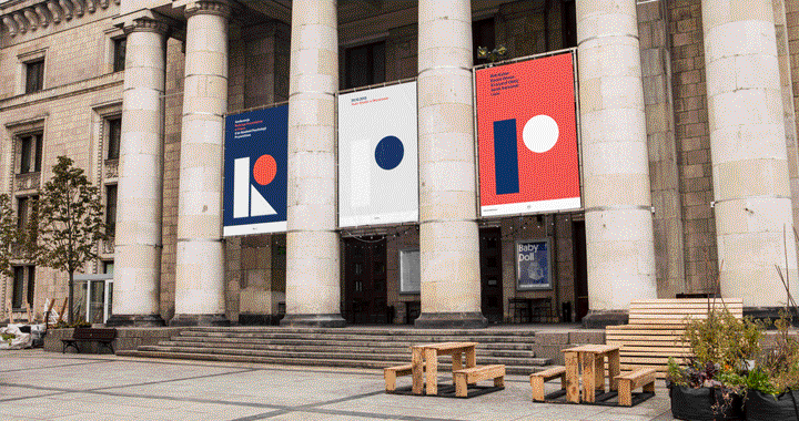
Redesign Przywództwa w Polsce ('Redesigning Leadership in Poland’ or 'Leadership Redesign in Poland’) was a conference for leaders on rapid changes held in October 2015 in Warsaw. The event featured famous speakers and a bold contemporary visual identity, designed by Andrzej Santorski.
Three main subjects were discussed: “how to manage in Poland 21st century”, “how to change our organizations with respect for tradition and openness to new trends” and “how to manage yourself, be authentic in the role of leader and how to help others change”. This feeling of change for better, a kind of reconstruction of the idea of leadership formed the concept of the whole identity.
A flexible system of basic geometric shapes was devised, turning the acronym of the event (RPP) in a group of building blocks. These simple elements were then rearranged in various compositions and color combinations, appearing constructed or deconstructed in banners, animations, event signage, printed ads, tickets, a booklet and even t-shirts for the staff, tote bags and more promotional material. Being given free hand by the Academy of Leadership, “The only limit was the budget and I've tried to push the identity as far as I could” comments Santorski, “It gives me a lot of joy to work across different media and coordinate projects where graphic expression fuses with architecture , moving image etc.”.
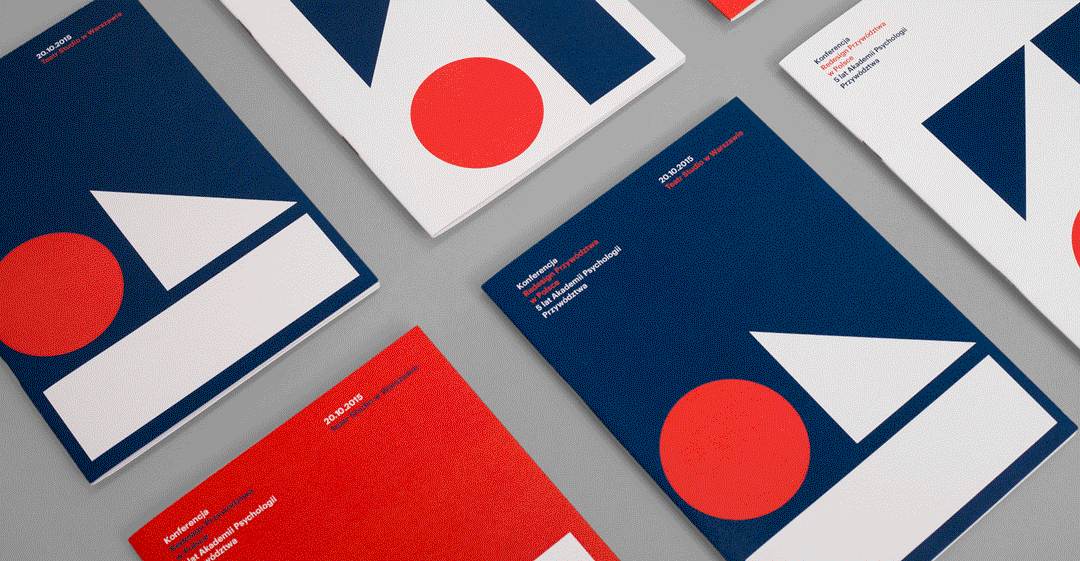
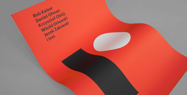
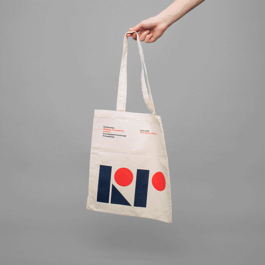
The location of the events is rarely taken into consideration when planning identities, but the Palace of Culture and Science in Warsaw, which hosted the conference, a monumental building with classical decorations and bright white interiors, was the perfect stage for a high-impacting visual work. “I’ve decided that the identity and signage – in contrast to the architecture – should be very modern and vibrant.” as summed up by Andrzej, who went on setting a strong orange/blue/white color scheme.
Graphik, designed by Christian Schwartz and Berton Hasebe for Commercial between 2009 and 2014, was chosen as the only typeface for the identity, nicely blending in with the somewhat trendy duotone and the geometric shapes of the RPP logo. In the overall formal consistency created by the large use of primary shapes however, the harsh edges of some of the icons created for the signage feel a bit out of place.
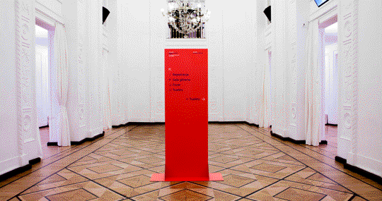
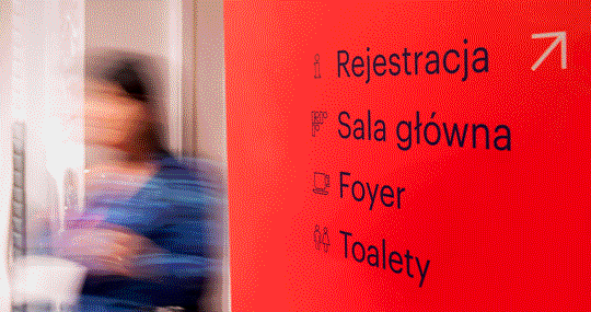
The execution of the project is clean and straightforward, also thanks to the fact that it had to simply serve the short life of the conference. In evaluating this small and tidy identity, it’s worth noting the conscious absence of oddness and eccentricity, quite unexpected from Poland, a land better known abroad for its expressive and excessively artistic school of posters.
“In my opinion, the task of a graphic designer is not to present his subjective vision, as it always stands in the foreground of the message. The main function of graphic design is to present the message in clear, legible and visually attractive way, while leaving some room for interpretation of the recipient.”