Renting posters
Torino, Italy. 2017
Alberto Arlandi,
From the editor's desk
Partner Institutions, Co-Presenters, Gold, Silver, Bronze, Major Sponsors, Media Partners: each one of those seem to pretend today a physical share of the visual identity of an event. The result is a soup of logos on white background at the bottom of dozens of posters, usually taking 15 to 30% of the total available space.
The term “soup” particularly indicates the mess of shapes, colors, sizes, proportions, typefaces that’s caused by having to cram 10–20 logos in the same group making sure they’re somehow aligned properly and evenly sized. Consequently, everything becomes illegible, and the only ones that are maybe noticed are those already known by the public.
On top of that, the more logos are packed or repeated, the more the communication turns into a sort of commercial, ultimately scaring away viewers that learned to ignore advertisements.
It’s difficult to track down where or when this practice started, but finding the aforementioned white band in posters for big events, museum or other institutions is very rare before the year 2000.

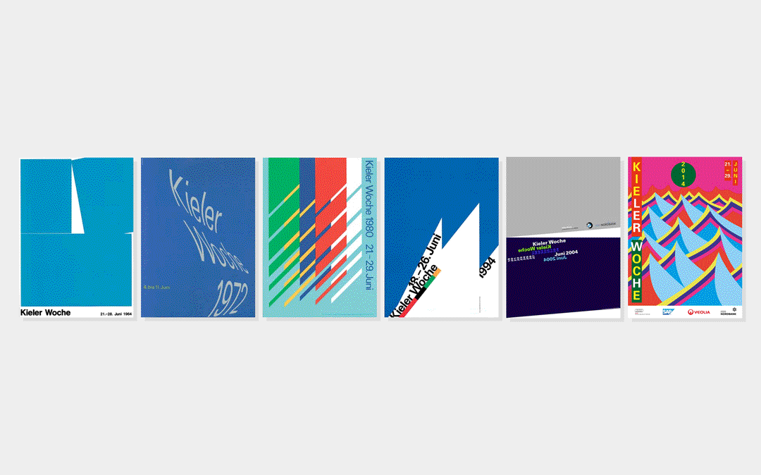
As an example, six posters were picked from the annual Kieler Woche, 1 a famous sailing event in Kiel whose “plakat” have always been created by world renowned designers in the last 60 years. The immaculate layouts started welcoming sponsor logos only since 2004, reaching an all-time high in 2014, clearly indicating a trend that with few exceptions is slowly polluting even the top tiers of graphic design production.
At the local and suburban level the state is even worse, where brochures for events are basically printed only to sell pages to sponsors. The issue should be clear even without providing visual examples.
However, as easy to spot as it can be, the problem doesn’t seem to be a matter of public discussion. By searching online, only one article from 2011 comes up about institutional logos on posters 2 and a single forum thread can be found, simply reporting ways to layout logos in different ways. 3
Given all these clues it can be assumed that somehow, selling large portions of posters to partners has become accepted by a significant portion of the design community. In the end, since the designers may be forced to withstand the largest payer’s will, everything comes down to the way sponsorship is flaunted.
Otl Aicher, in World as Design, very harshly states that “anyone who produces rubbish needs art” pointing the finger against “the economic strategy of promoting art, supporting festivals, symphony concerts and art exhibitions, building museums, setting up galleries, making cultural tourism possible” perpetrated by big industries to redeem themselves in front of consumers.
Sponsorships seem to be becoming a way to commercialize art and culture as some company’s product, ultimately adding to the noise of our current visual environment. If this sounds like a marginal issue for designers, do imagine some of the iconic posters by Milton Glaser with a row of logos from banks, insurance companies, fast food restaurants and car manufacturers.
-
1
Gallery of posters for the Kieler Woche (kieler-woche.de)
↩︎ -
2
Discussing logos on posters (betterposters.blogspot.it)
↩︎ -
3
Sponsors and alternative layouts (graphicdesignforum.com)
↩︎