Soma
Tokyo, Japan. 2016 Design by Kamimura
Michael Klein,
Founded by Masaru Kawai, a Japanese wood artist, SOMA is a lifestyle brand focusing on wooden culture and coniferous products. With a contribute from Sachi Kamimura, we explore the intricacies of designing between past and future.
From the editor's desk
Japanese design and architecture have held a special spot in Western culture ever since Bruno Taut discovered the Katsura Imperial Palace, and particularly since Walter Gropius and Le Corbusier – two founding fathers of modern architecture – lauded it as a masterpiece that served as an inspiration for their own modern work. After that, Japanese architects began to pay more attention and pride themselves more in their own traditions.
It might happen that a tradition is rendered obsolete by technology, leading to a cultural loss and sometimes even physical waste. «In Japan, people had planted trees as a general material to make things for life such as houses and furniture» explains Sachi Kamimura, studio manager of Kamimura. «However, since the decline of timber demand along with modernization, there are many left trees as non-used resources. Masaru Kawai, a woodworker, started SOMA as a project to use the trees and asked us to join as directors of visual communication».
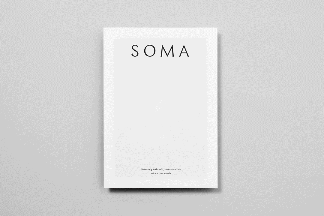
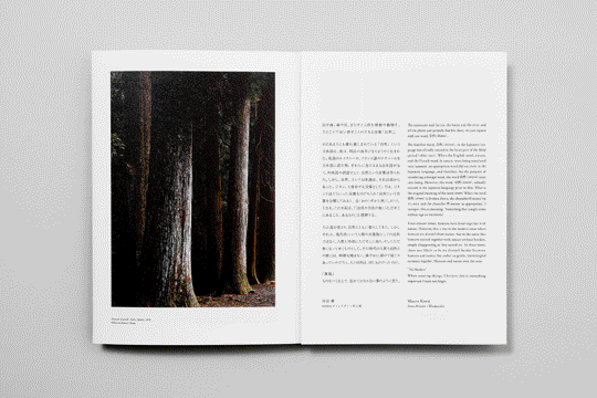
The identity that Kamimura devised is strikingly simple, yet remarkably powerful in conveying a feeling of Japanese tradition through graphical means. It sits in perfect balance between tradition and modernity, eschewing the use of fashionable elements.
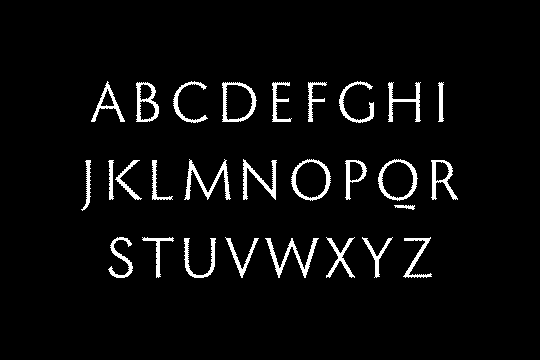
Preferring a purely typographic approach (a seemingly signature choice for the studio) the identity and logotype are developed around the concept of a new typeface that is derived from abstracted tree elements. These are developed into the vertical and horizontal axis of the typography, as well as in modulations and optical corrections that ensure legibility.
«We create [a new typeface] if there is no suitable one» continues Kamimura. «Every text can [communicate] meaning just when that is written based on rules of languages. However there are also tones that would lack by just plain text itself; like people need their own voices to tell something. For SOMA, we adopted a new tone by a new typeface and unconventional layout to let people find the value of the quite normal resource».
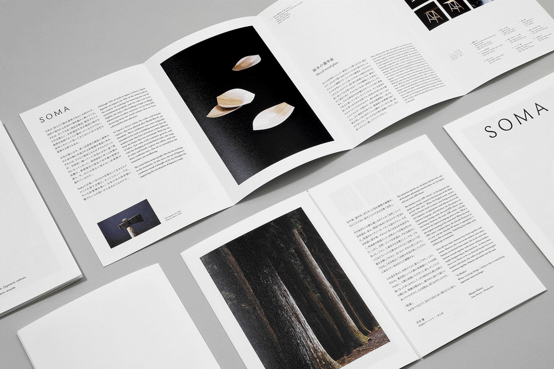
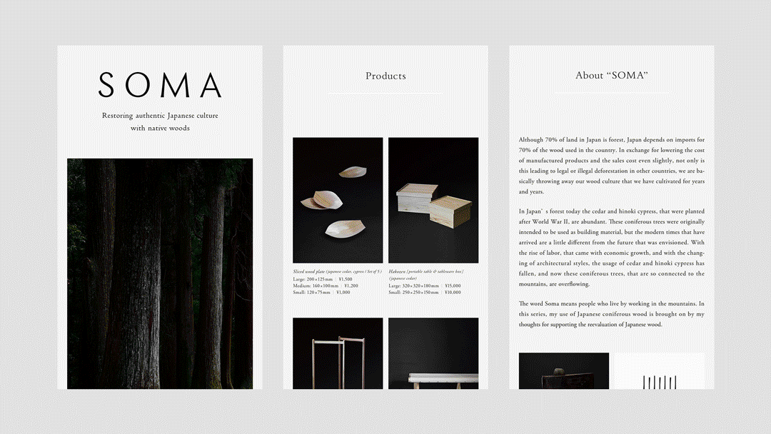
For all the good work, however, the typeface seems to see little application both in printed materials and digital. The vast majority of text appears to be set in a postmodern serifed typeface – one with elements of both the capitalis monumentalis (Roman uppercase letters), baroque and neoclassical typefaces. While there are arguably better alternatives out there, the restraint of the layout counterplays the typeface, resulting in clear and elegant pieces across digital and print.
In printed pieces specifically, the choice of paper adds a layer of refinement that is in tune with the rest of the design choices. «Paper is originally made of trees. We've used eco friendly uncoated paper. Reducing extra paper items is more important» comments Kamimura.
Photography is also worth mentioning, as the art direction on the shots contributes to the elegance established by the logotype, materials and layout. There is a feeling of peacefulness and timelessness to the whole identity that just commands the eye to stop, look, read and appreciate. In a time of cursory reading and multitasking, this is a rare achievement.