The Form of Form
Lisbon, Portugal. 2016 Design by R2
Alberto Arlandi,
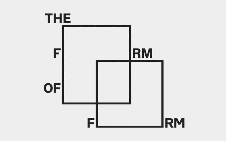
The fourth edition of the Trienal de Arquitectura de Lisboa, held in 2016 in Lisbon, Portugal, focused on highlighting the multiplicity of thoughts currently existing in the production of architecture. The Porto-based studio R2 designed the whole identity starting from a single, appropriate visual concept.
“The visual translation of the title follows the strategy of redundancy, equivalent to the way in which the title itself constructs its meaning when spoken”. Varying thoughts and their resulting designed form are simply represented by generating new spaces using only the typographical elements in the title.
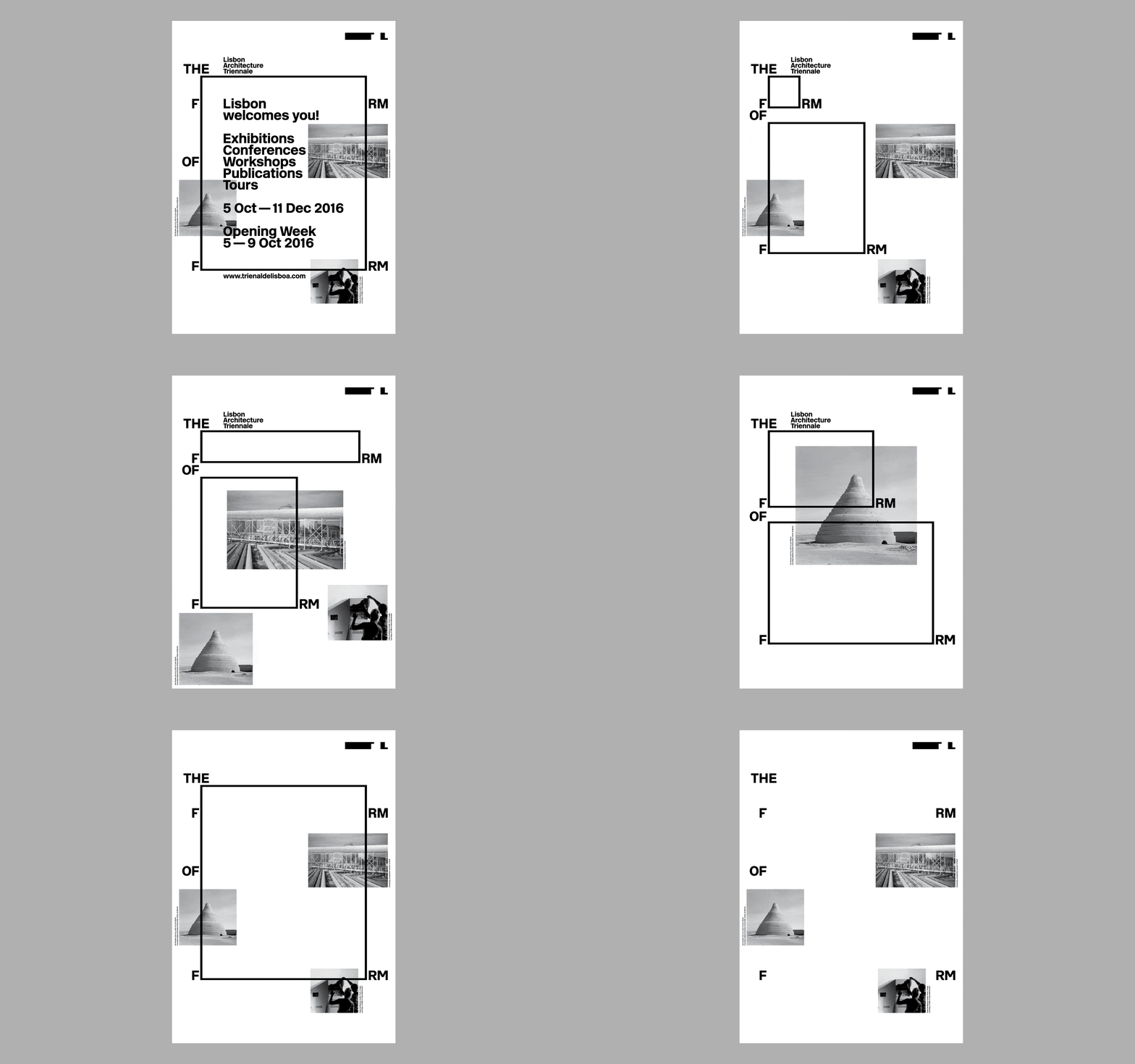
“From the rubber stamp to the cartographic base, The Form of Form reacts according to the circumstances and the contents, making the most of its elasticity to bring together a panoply of events under a common identity that can be easily shared”. Having already explored the value of responsive identities in a previous issue, what’s worth noting here is the flexibility of meaning and uses of the large square “o”s.
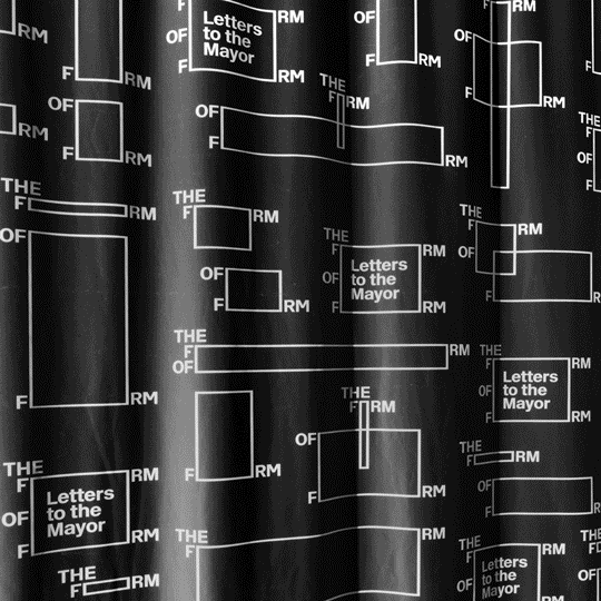
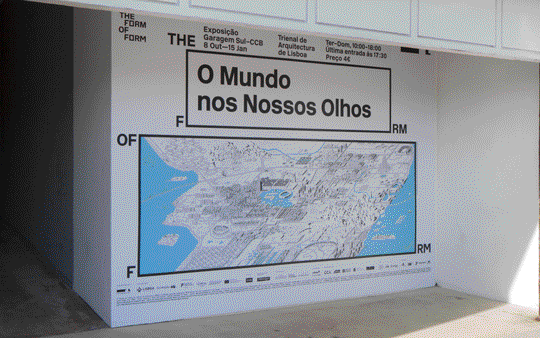
As an example, the exhibition “Letters to the mayor” simply uses the O as container for the title. However, the same rectangles instantly get the new meaning of sheets of paper of various sizes by being placed next the word “letter. The exhibition “The World in Our Eyes” on the other hand uses the O as a sort of window above an isometric city.
This expanded set of possibilities created by the clever use of the logo sets a new stage in blurring the line between the logo and other parts of the design system. It finally becomes and identity as a whole, instead of the sum of logo, photos and other elements.
A rather surprising detail is the choice of a single sans-serif typeface, straight from the early Sixties. Albeit being a redesigned and slightly adjusted digital version, the New Rail Alphabet 1 still proudly displays most of the features highly praised by “modern” designers back in the day. The large x-height, the uniform look, the precise cuts remember us of the first successful attempts at organizing wayfinding and communication in identity systems.
Seeing a typeface that still bears lots of similarities to Helvetica being used in a contemporary way without falling into imitating the look of the early modern days is a welcome achievement. In addition, new glyphs were designed (F, R and M) to avoid visual repetition in the word “Form”, thus giving a unique characteristic to the logotype. Henrik Kubel was responsible for these new letter forms.
R2 explains that typesetting is spartan, “displaying an economical approach to available resources”. Results vary though, ranging from visually interesting brochures with a bright touch of color to a couple of unforgiving columns of text.
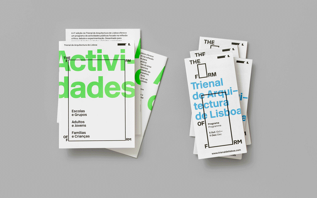
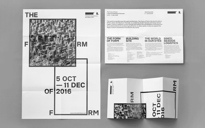
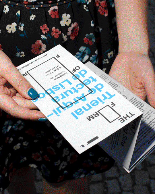
The use of color also sets a hierarchy between the parent container, the Trienal de Aruitectura, which usually maintains a black&white scheme, and its events and activities. Single visual identities inside the main event can be spotted through the different use of typography, photos or drawings, sizes and proportions.
Although the discussed themes will vary, it is hoped an updated identity or at least an equally powerful will be adopted, given the successful graphic outcome of the 2016 edition.
-
1
New Rail Alphabet (newrailalphabet.co.uk)
↩︎