Branding and Corporate identity
Norma makes identities for businesses.
Contact us at [email protected] with your idea.

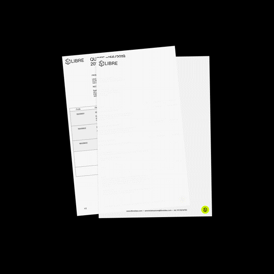
Searching for Brand Identity Design online the results are on the average the same mock-ups: letterheads with large colour fields that would be impossible to print with a normal office printer, a colourful folder with a large logo in the centre, an envelope that does not comply with mailing guidelines, business cards that do not contain enough contact details, pencils and paper clips, neatly positioned for unknown reasons.
These examples of brand identity are easy to recognise: they are fake. They were never useful to anyone. Saving perhaps business cards, of which 1,000 are printed and 5 are used, it is incomprehensible how a company in 2022 could still need an envelope with letterhead. The only possibility of redemption is that they are indeed photos of coordinated images taken 30 years ago: things that belong to 30 years ago.
At a higher level, the brand identity manual is still a relatively revered object among designers, who look back with nostalgia to a time when these objects were really used by corporate departments dedicated exclusively to communication. There are even sites that would allow designers to create brand identity manuals as if they were websites, openly accessible to anyone who needs them. Who really needs them anyway? Nobody.


Although the concept of brand identity is still valid, at least in the sense that there is a common and coherent language to be adopted for any corporate communication, as already addressed in Nothing special, it is now impossible to decipher what can make a company 'unique'. In the fragmentation of contemporary communication, the identity of a brand, which by definition should refer to something singular, is actually a massified product.
With the ephemeral conviction of obtaining something truly tailor-made around the peculiarities of a company, one instead ends up choosing a logo and matching stationery from a narrow range of possibilities. Gotham bold all caps in blue? Or perhaps a symbol with a gradient and company name to the right of the symbol? Why not a logo that is actually a stylised illustration of the company headquarters?
That is why Norma designs corporate identity solutions using simple and direct language, adopting the same solutions over and over again if they're proven working well. Communicating in an honest way is much more important than the colour you choose to do it in, so you might as well not choose a colour at all.
Contact us for a quote
Norma makes identities for businesses.
Contact us at [email protected] with your idea.