Ideas for an anti-browser
“Excuse me, sir, but where’s the content?” Amid so many animations and parallax transitions, it’s hard to find information.
Norma,
The year 1990 marked an important moment in history for the development of contemporary communication media: the World Wide Web entered into operation, the first browser to access the information network Sir Tim Berners-Lee had created at CERN the previous year.
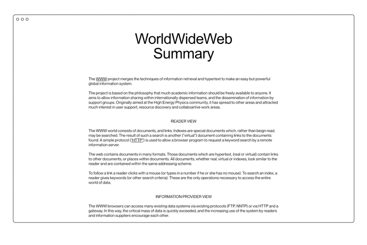
It was all in grayscale because it ran on NExT machines, images could be displayed exclusively on separate windows, and there was a limited set of instructions to give text a hierarchy (the so-called “HTML”) – but what it did was not that different from what browsers do today: it provided an access point to the web.
What is interesting is precisely that the historical event was not the creation of the web (as Internet protocols had existed for over a decade by then) but the launch of its “viewer” – because, unlike other media, the World Wide Web allowed you not only to receive information, but most importantly to alter the way it looked, personally interact with it, and create new information.
No TV (meaning the receiving device) is able to change the look or flow of a program, but a browser can. If we had browsers that changed every blue into red, the Internet would have no blue and users could do nothing about it – in fact, they would be certain that no site would ever contain any blue.
We deduce that the entire perception and use of the network directly depend on its access point. The browser is a kind of border, and the way you visit every new state changes depending on your visa.
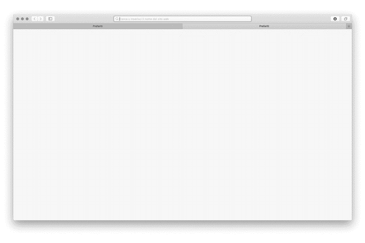
However, today we are used to the fact that a browser is a window with a bar where we can find the URL address of the page we are viewing, navigation buttons to go back and forward, and a series of horizontal tabs along the top margin.
Certain elements in the page we visit may turn our cursor into a white hand, and by left-clicking on them we can change the content of the page itself. We are used to having areas we can interact with, more than to the original concept of hypertext. At the user’s discretion, new content can be viewed in a different tab in order to keep the original one open.
Information is presented to us exclusively as the owner of the site intended. A code is decided in advance, and it is up to the browser to follow it as precisely as possible.
However, information is often ephemeral, because websites are temporary experiences. Content could disappear or be altered without notice: in any case users are always just guests, visitors, who are not masters of anything – even when they have provided the original data.
Our access points are extremely limited: usually a search engine or a social network. Due to the self-referential nature of most websites, navigation rarely goes further than the first page visited.
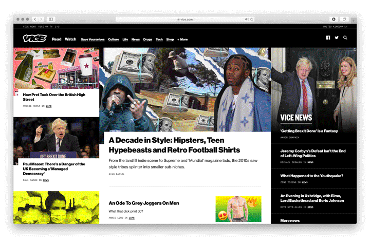
Thanks to the technologies made available to browsers, sites have evolved to command our attention. There is no space left on the page: wherever you look, a new element has been placed to make you stay on the site. Sites are built around bounce rates.
Even with all the technologies made available in the last 20 years, user experiences are not that different between sites, and unfortunately are not positive either. Especially on mobile, most sites welcome visitors with a wall of popups that force them to consider subscribing to the newsletter and accept cookies before they even have the chance to read the first sentence.
It seems like all the technologies not related to pure HTML have served no purpose, since in the end all pages have a header, blocks of images, a hamburger button menu, a “contacts” page, an “about us” page.
“Excuse me, sir, but where’s the content?” Amid so many animations and parallax transitions, it’s hard to find information. How is it possible that a file from 1987 1 is still perfectly readable and dense of content instead?
The diluvial nature of contemporary media leaves little room to breathe. Thus the challenge is to cultivate the patience and discipline necessary to engage more deeply than we are allowed. Just because we are submerged, does not mean we have to drown: the comment by James Jackson Toth 2 actually describes an issue that is broader than the context of music he originally referred to.
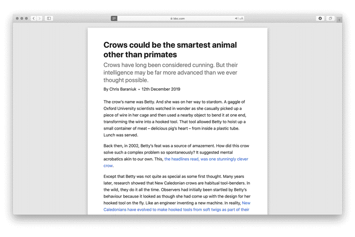
Microsoft already took an interesting step towards a less chaotic use of the web in late 2013, with the introduction of the “reading view” on IE11. Apple’s Safari followed the next year. Chrome has had a Reader mode since 2020, among the experimental functions that can be manually activated.
With the reading view, you enter a neutral zone where only relevant content exists (maintaining its original hierarchy), and any style or script is cancelled from the website. In addition, users are completely free to change the font type, colour and size of the text to support reading, almost like on the first versions of Netscape.
If the reading view effectively cancels the browser, the first idea that comes to mind might be to create a browser free of all the browser parts.
Reverse the current situation, and then ask yourself what works. No buttons, no address bar, no horizontally arranged tabs, no favourite icons and no bookmarks column, nothing between user and information.
All interactions with the browser take place with keyboard shortcuts and gestures we are already used to. Cmd + N starts a new session, swiping right with two fingers goes back, cmd + click opens a link in a new window. Forcibly using an entire horizontal strip that is between 60 and 100 pixels tall on the screen to display the current URL and the navigation keys is a considerable waste of space that could instead be left to the only reason why the browser was opened in the first place: to see the Internet.
More precise controls and commands are available, in any case, in the menu bar. They may be an extra click away, but are much less distracting.
At the heart of this neutral zone, there is a significantly improved “reading view”. Starting from technologies already available in text-based browsers such as Lynx 3 or Browsh, 4 the goal is to give reading a pleasant appearance, respecting the hierarchy in the page, leaving websites’ useful elements as intact as possible. Menus are transformed into discrete link lists, unnecessarily complex layouts are reduced to a central column of text and images, disproportionate or difficult-to-read content is made typographically more pleasant.
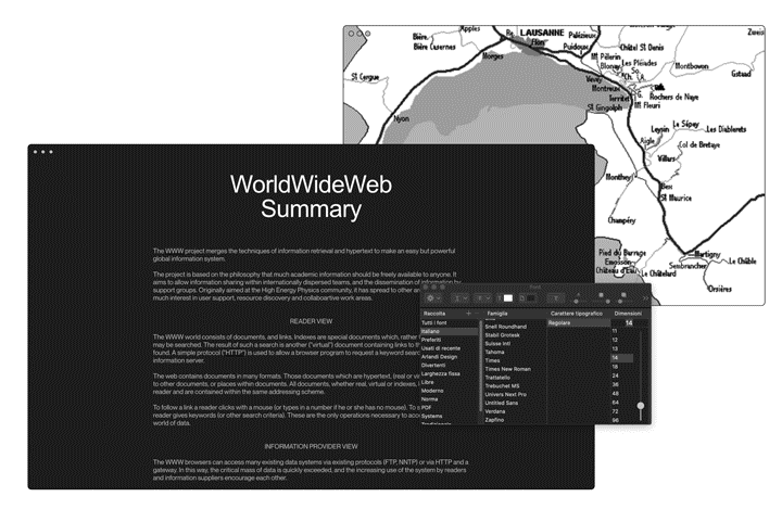
The browser respects the system’s light or dark mode, especially to avoid blinding visitors with large white backgrounds at night. Images and videos are given less importance than text to avoid distractions, but they can still be enlarged individually when their resolution allows. Furthermore, it is possible to highlight and comment the content of the page: notes will be saved, unless the page itself is altered.
In addition, since readers – and not content owners – decide how to use the content, they are given the freedom to customise typefaces, font and background colours, text and column sizes.
In a browser where navigation does not start from a search engine or a social network, hyperlinks – the original concept at the base of the “network” – must be strengthened.
Site authors should be encouraged to create more links to other pages, to create interesting content so that other pages will link back to their site, and to create personal site indexes. While Google’s algorithm is very good at giving generic results, it can never surpass a curated list of links by topic.
Numerous semantic tools are available to site owners to better define the hierarchy of each page, the type of interactions and the information they contain.
There are specific syntaxes for link lists, but also for bibliographies, captions, notes and references. There are attributes to indicate the type of a multimedia file (a technical drawing will be processed differently than the photo of a dress, the frame for a video will be different from the one used for an image), and metadata can be used to contact the author of the page, to indicate web ring affiliation, etc.
And all these tools comply with W3C standards, in order to guarantee sites will be compatible with all other browsers. Web 3.0 – the “semantic web”, not the web of crypto-scams – was supposed to be the great milestone of 2000 but was never realised. All available metadata are inspired by that idea but in no way constitute a traffic advantage over other sites.
Finally, the last step to reconcile an anti-browser with the initial vision of the World Wide Web: active participation. The first browser was simultaneously a reader and an authorial and content medium, a function that over the years has been transferred to special servers out of convenience – centralising information ownership in the hands of few distributors.
Internet users today are rarely authors: they must rely on designers, developers and distributors or on third-party platforms. Projects like Beaker 6 tried to build back this possibility, also by relying on decentralised protocols to share one’s own content and re-share other authors’ pages.
An anti-browser, precisely because it is not just a means to explore (browse), must also be able to modify and distribute simple HTML pages.
—
The anti-browser is a passport to access the same Internet we already know, but from an alternative entrance.
-
1
The LOD/H Technical Journal: File #1 of 12 Volume 1, Issue 1. Jan. 1, 1987 (textfiles.com)
↩︎ -
2
James Jackson Toth: “Too Much Music: A Failed Experiment In Dedicated Listening”. NPR, January 2018. (npr.org)
↩︎ -
3
LYNX - The Text Web-Browser. (invisible-island.net)
↩︎ -
4
Browsh. The modern text-based browser. (brow.sh)
↩︎ -
5
“Whatever Happened to the Semantic Web?”. Two-Bit History, May 2018. (twobithistory.org)
↩︎ -
6
Beaker Browser. (beakerbrowser.com)
↩︎