Websites must be accessible
Showcase sites that showcase nothing, and the web design at the origin of the web.
Norma,
There is a set of guidelines drawn up by the consortium responsible for the general standards followed in the Word Wide Web 1 (the W3C), known as WCAG 2 (standing for Web Content Accessibility Guidelines). It is widely ignored by most designers and most of the programmers that lend themselves to design (insert here a mea culpa for many works currently signed by Norma), although its introduction describes the document as able to “explain how to make the web more accessible to people with disability.”
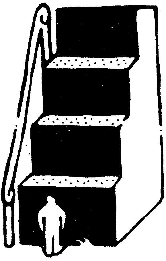
With an analogy to architecture, one could imagine that this document suggests the use of ramps to facilitate movement for people in wheelchairs where a staircase has been designed. The word “disability” is used correctly, yet seems to suggest that the web is already accessible for all people without physical or mental issues. However, continuing the analogy, a large part of the Internet today not only lacks paths suitable for anyone burdened by a handicap, but also proudly displays insurmountable steps, doors without handles and open manholes.
It is impossible to quantify the extent of inaccessibility in the vastness of the Internet, but three studies provide some completely unsurprising data. The first is a 2003 study by Lazar, Beere, Greenidge and Nagappa, 3 which analysed 50 governmental, non-profit and commercial sites in the Mid-Atlantic United States, finding only one met WCAG standards. A follow-up study on the same sites in 2006 4 concluded that, albeit with various changes and some improvements especially as regards alternative text for images, “on average, the 50 websites increased the number of accessibility flaws over this time period. Websites had actually been made more inaccessible.” Finally, a more recent research (Leitner, Strauss and Stummer, 2016 5) analysed 89 private Austrian web pages, of which only 11 (12%) fully passed accessibility tests, confirming the little interest in the matter even after years and in a completely different geographical area.

The Internet makes for a frustrating experience, both for people with disabilities and for everyone else. Think of:
- Homepages showing up on smartphones completely covered, half by pop-ups promising a 10% discount and the other half by banners forcing you to accept advertising cookies – else you simply cannot see the page.
- Advertising videos that cannot be skipped, advertising banners that insert arbitrary code in the host site, transparent layers that capture clicks to direct them to advertising pages.
- Headers that remain fixed while scrolling, taking up 80-100 pixels of vertical space on the screen.
- Carousels of images and texts that scroll every three seconds, assuaging an inability to give the content of a page a defined hierarchy.
- Tracking scripts that analyse behaviours on multiple websites to confirm identity.
- Blogs that divide content into “galleries” on multiple pages, in order to increase banner views.
- Audio that plays automatically at the first click, without warning.
- Newsletter subscription buttons that are active by default, followed by emails where the unsubscribe option is carefully hidden.
- Anti-spam systems that engage users for minutes in search of invisible traffic lights, pedestrian crosswalks and chimneys.
- Constant calls to share the content being viewed, on any possible social network.
- Windows that order users to download an app to enjoy a better experience, on websites clearly not designed for smartphones.
Today’s web no longer stands out for the desire to offer information and content, but for the lack of respect for users and their time.
Brad Frostcalls it out as bullshit, in the aptly named mini-site Death to bullshit, 6 based on a talk he gave for Creative Mornings in Pittsburgh in 2013. Even pages dedicated to the issue 7 are a collection of animations, web fonts and large images: one might wonder if the legendary “eight seconds of attention” rule 8 applies not only to the people who visit a website but also to those who write some of the content on the Internet.

Unfortunately, users are at the complete mercy of any sadistic decision the designer on duty has made regarding their online experience. If I am forced to download 80MB of videos 9 to open an information page – which translates into minutes of bandwidth saturation for the majority of the population that still does not have, and perhaps will never have, fibre optic Internet – the responsibility does not belong to the programmer who didn’t do enough to build a “fast” website, as much as to whoever designed such a page.
Instead, the responsibility is placed on the shoulders of the end user, whose only alternative to spending money on faster devices and better connections is to suffer take-forever slow loading. The approach is similar to portraying waste sorting at home as a solution to the ubiquitous pollution of plastic, which is actually caused by producers who have not stopped using this material in the first place. 10
People who look for information on the Internet now find containers of narcissism for clients, designers and developers whose ego is expressed with full-page, 4-MB-a-piece images, useless animations that make navigation less “boring”, and complex frameworks used to build one or two pages maximum. Which is irrelevant to those who thought of these pages on a 27″ screen with a 100-Mbps download connection – just like a button too high to be reached while seated makes no difference for a person who is able to stand up.
After all, those who design and program websites can do “nothing special” as long as the most celebrated achievements are awards by Awwwards or SiteInspire, showcases that usually repost the most extravagant, technological super-complicated projects where everything moves (lagging) and nothing can really be understood. And while these are just the tip of the iceberg of excess – objects in a class of their own – they provide an aspirational model for a much wider audience, by moving the bar of inaccessibility from settling for huge, slow-download images to accepting that an entire site can be built on WebGL 11 just to make animations a few frames per second more fluid.

Compared to the first 20 years of the web, in the last decade the browser landscape has changed a lot: most of them now rely on a single rendering engine – WebKit/Blink 12 – and updates, now automatic and silent, are much more frequent. (Chrome publishes new versions almost monthly.) Consequently, adoption of new technologies by the majority of the public, in the form of new layout possibilities, is much faster.
The great variety of browsers and more or less powerful devices available initially drove efforts to ensure every visitor had the same experience, regardless of the type and age of the browser in use (although too often this was resolved with a banner that encouraged people to switch browsers). Instead, today’s race for new materials shares the flavour of innovation in architecture’s construction options: in both cases, using the latest technological advances is not automatically synonymous with good work.
If we consider a house as a place made, above all, to live in, the fact that alveolar polycarbonate gels or other exotic materials have been used to build it is absolutely secondary. Tenants do not ask themselves what is inside the walls: they wonder whether they will be comfortable. Visitors usually open a website because they are looking for one specific piece of information, and designers instead decide that, before finding it, users will have to deal with pop-ups, videos on autoplay, animations and sensationalist transitions made with the latest discoveries available to programmers. These are all architectural barriers (made with smart synthetic fibres).
Is this what is meant by “showcase site”? A showcase of all the shop’s best to attract passers-by, possibly painting a scene that’s as fake as it is amazing, with disproportionate mannequins and great copy promises. Then, if the information we were looking for is nowhere to be found – because Google is losing the eternal struggle between search engines and sites built intentionally to rank high with non-existent or badly copied content – 13 we all end up with beautiful narcissistic shop windows built on nothing.

We are past Oliver Reichenstein’s question, “What happened to blogging?” 14 We now wonder what happened to useful websites. Take Ken Rockwell’s site, 15 and the extremely detailed page 16 in which he describes how to shoot film with great professional skill, examples and external links. Now compare it to what Google considers the top result for a “best photo film” search. The page by Digital Camera World 17 is an article built around Amazon affiliate links and the bits of code Google values most – nothing more: it provides no useful information, shows no examples for each type of roll, and tosses everything in with six pointless JavaScript files and over 16,000 lines of CSS code.
What happened to websites? Just start by verifying the actual validity, truthfulness and quality of the content you want to put online before any interference dictated by layout reasons (or limitations); organise it in a sensible form, with a logical hierarchy, through a clean code in compliance with WCAG standards. Of course, you’ll end up with a trivial HTML page that anyone could create: but it will be useful to someone.
Reverse-design websites. Or you could stop designing them at all, abstain: but in contexts where radicalism does not take root, not having a cookie banner or a Facebook icon for easy sharing may be a pipe dream, if not a downright scandal.
Somehow, even blindly applying the exact same pattern – a large stock photo bought for pennies, centred text that ends in transparency, a low-resolution logo at the top left, a hamburger button menu at the top right, services listed in three columns, each one with its fontawesome icon, 18 an “About” page and a “Contact us” page – can be considered a form of design abstention. Surely a turn towards the homogenisation of layouts perpetrated by the continuous use of templates sparks in visitors the confidence we need to convince them our news or information is truthful, or to encourage them to purchase our goods anywhere they find themselves on the web – but to the detriment of the opportunity of actually enhancing content.
A site like Ken Rockwell’s, on the other hand, earns readers’ trust with what it says, not the way it looks. And paradoxically, today, given the rarity of sites so dense in content, that aesthetic (at least until it is overexploited) has become a sure sign of a page written with passion and competence.

So let’s go back to a simpler Internet in form and in content, one that is more open and more varied. Visual aspects will be secondary: the possibility that two blogs share the same layout with black Times New Roman text and blue links, like in the late 1990s, is irrelevant as long as both offer a valid and interesting service. There are thousands of websites set up with similar typography, just as there are thousands of people who look alike – but some are empty, others have ideas.
For those who cannot escape the patterns that today inspire more “consumer confidence”, consider these solutions:
- Nobody likes pop-ups, and there are dozens of alternatives for all scenarios. 19
- Creating perfectly functional sites without cookies is possible.
- Advertising is undoubtedly a direct way to monetise Internet pages, but sites like Fontsinuse solve the problem remarkably by offering advertisements that are integrated into the layout and interesting for visitors.
- The existence of a navigation bar at the top of the page is such a well established pattern that it is not necessary to constantly remind users of its existence through a fixed header: if and when they need it, they can scroll back to find it.
- Ordering content by relevance is possible, even without the use of animated carousels: simply decide what goes first and what goes next.
- Google Analytics is not the only tool to track user traffic and, actually, some entirely self-sufficient solutions are available. 20
- Making signing up to the newsletter an optional, voluntary choice avoids discrediting the entire communication tool only to obtain subscribers who are not interested in it anyway.
- Avoid fuelling the Internet’s centralisation around social networks with sharing suggestions or requests for likes: encouraging the use of social networks actually decreases traffic to independent websites.
This site is what it has to say. It has no tracking cookies, no pop-ups, is accessible and has no 3-MB stock images. The person who designed it is, first and foremost, someone who visits other websites, and this is how they would like to be welcomed everywhere.

-
1
W3C: World Wide Web Consortium (w3c.org)
↩︎ -
2
WCAG: Web Content Accessibility Guidelines (w3c.org)
↩︎ -
3
Jonathan Lazar, Patricia Beere, Kisha-Dawn Greenidge, Yogesh Nagappa: “Web accessibility in the Mid-Atlantic United States: a study of 50 homepages”. Universal Access in the Information Society, November 2003. (researchgate.net)
↩︎ -
4
Jonathan Lazar, Kisha-Dawn Greenidge: “One year older, but not necessarily wiser: An evaluation of homepage accessibility problems over time”. Universal Access in the Information Society, May 2006. (researchgate.net)
↩︎ -
5
Marie-Luise Leitner, Christine Strauss, Christian Stummer: “Web accessibility implementation in private sector organizations: Motivations and business impact”. Universal Access in the Information Society, June 2016. (researchgate.net)
↩︎ -
6
Brad Forst: “Death to Bullshit” (deathtobullshit.com)
↩︎ -
7
Hanson O'Haver: “The web looks like Shit”. The Outline, April 2017. (theoutline.com)
↩︎ -
8
Kevin McSpadden: “You Now Have a Shorter Attention Span Than a Goldfish”. Time, May 2015. (time.com)
↩︎ -
9
Studio — Dinamo Typefaces (abcdinamo.com)
↩︎ -
10
A recent episode of 'Last Week Tonight' with John Oliver explores the issue (youtube.com)
↩︎ -
11
“30 Experimental WebGL Websites”, March 2022 (awwwards.com)
↩︎ -
12
Chris Coyier: “Browser Engine Diversity”. CSS-Tricks, September 2019. (css-tricks.com)
↩︎ -
13
@SwiftOnSecurity: “Every week Google search becomes worse and worse and we’re so used to it nobody even talks about it anymore”. Twitter, April 2020. (twitter.com)
↩︎ -
14
Oliver Reichenstein, “Take the Power Back”. iA Blog, February 2018. (ia.net)
↩︎ -
15
Ken Rockwell, “How to shoot film”. (kenrockwell.com)
↩︎ -
16
Ibid.
↩︎ -
17
Rod Lawton, Louise Carey: “Best film: our picks of the best 35mm film, roll film, and sheet film for your camera”. Digital Camera World, October 2020. (digitalcameraworld.com)
↩︎ -
18
Font Awesome. “The web's most popular icon set and toolkit”. (fontawesome.com)
↩︎ -
19
Anna Kaley: “Popups: 10 Problematic Trends and Alternatives”. NielsenNormanGroup, June 2019. (nngroup.com)
↩︎ -
20
Shynet. “Modern, privacy-friendly, and cookie-free web analytics”. (github.com)
↩︎