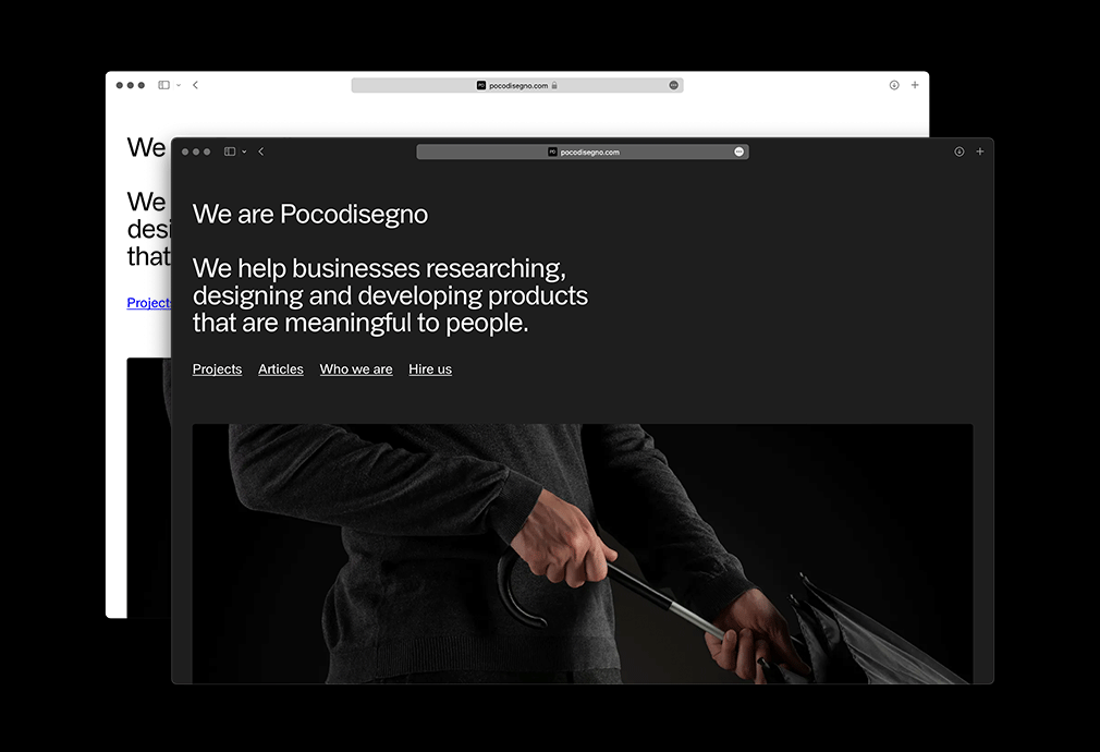
A website but not too much
In the first months of 2021 Gianluigi Frezzini and Fabrizio Gagliano contacted Norma to refresh the identity of their product design studio, Pocodisegno, asking for a functionalist approach in line with their cultural approach to work. The shared values with our "anti-graphics" program made it possible to arrive very quickly at a visual solution made of "almost nothing" that could give great space to the images of the objects.
As already tested with Confcooperative, the affinity with the scene of young Turin designers inspired the use of Arial Grotesk by Alfatype for the entire identity.
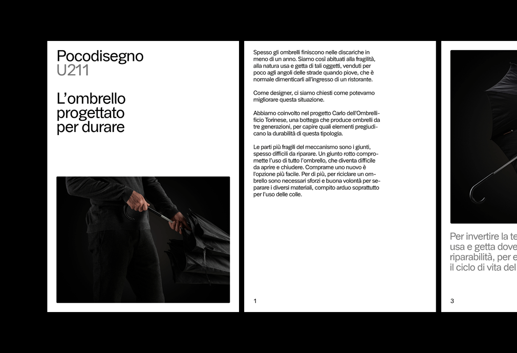
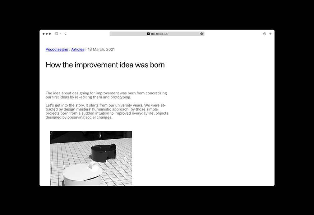
The content of the site is set along a single column, with a clear textual hierarchy and few variations in the layout of the images. However, every page's structure is composed with modules (texts and images) that can be reassembled, so as to leave maximum freedom in the construction of the best narrative for each object presented.
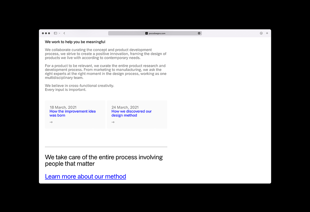
The functionalist approach is emphasized by the use of underlined blue hyperlinks, a metaphor for the importance of technical reasoning as opposed to stylistic whims.
Photography
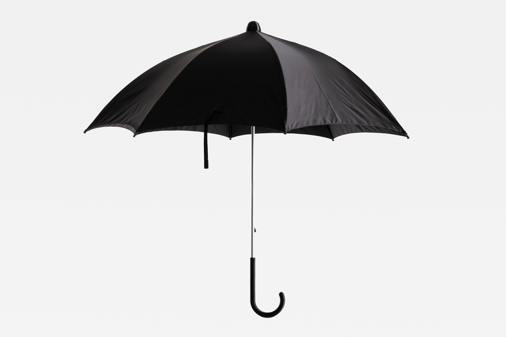
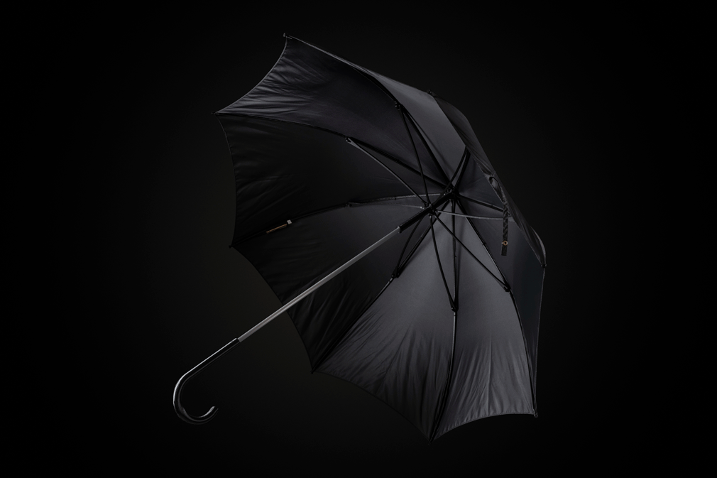
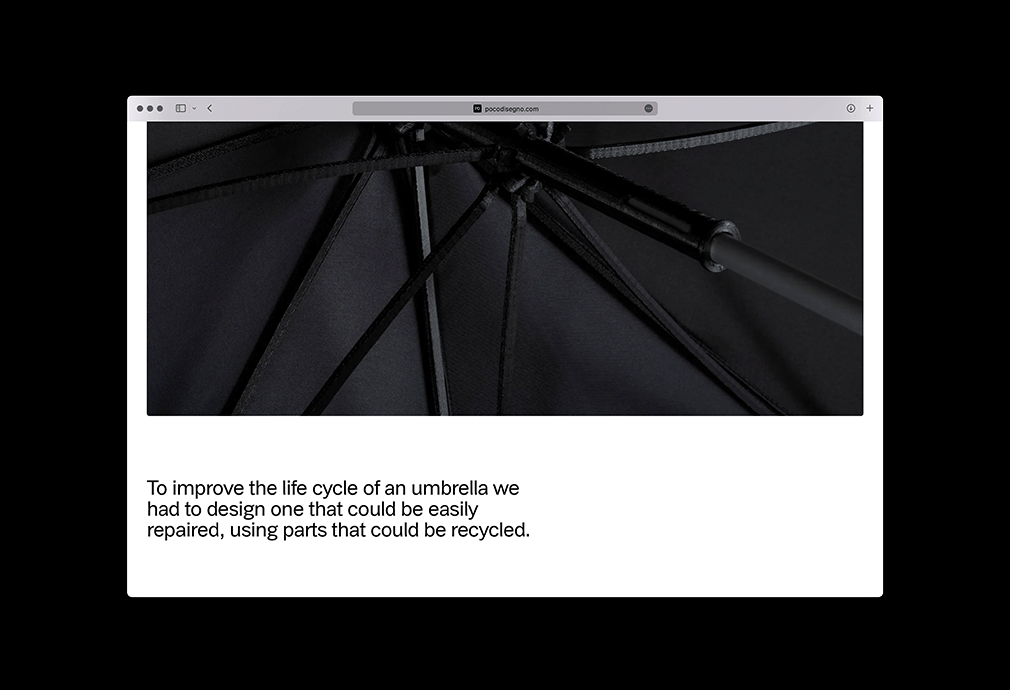
The photos for the new umbrella designed by Pocodisegno, published in conjunction with the new identity, were taken by Federico Villa. To maintain consistency with the simplicity of the overall communication, Norma asked for the use of neutral backgrounds, mainly black, and great respect for geometry in the construction of the shots. Some images have been "humanized" by the presence of hands, in order to better show the size of the objects and their use, but never with emotional aspiration.