Almost nothing for Balestra
Balestra was founded in Rome in 1959 by Renato Balestra. In 2022 the historic maison underwent a natural metamorphosis and inaugurated a new phase. Having renewed the logo together with BRH+, Balestra relied on Norma to detail the coordinated visual identity and a new website.
The project ignores any logic of innovation, creativity or clichés related to fashion. There is no large photo to welcome the homepage, the logo sits small at the bottom and there is no identifying element other than the very essence of titles, text, (Balestra blue) links and images on a white sheet. Rather than being an end in itself like the empty minimalism of other major contemporary fashion sites, Norma's long-established defaultism has a real effect on the technical efficiency of the site.
If every page on the Internet emits CO2, then pages that weigh less than 500kB, load in a fraction of a second, in full compliance with W3C standards and accessibility best practices, reflecting Balestra's ongoing commitment to environmental responsibility.
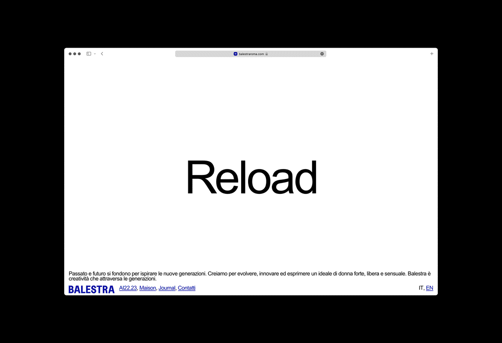
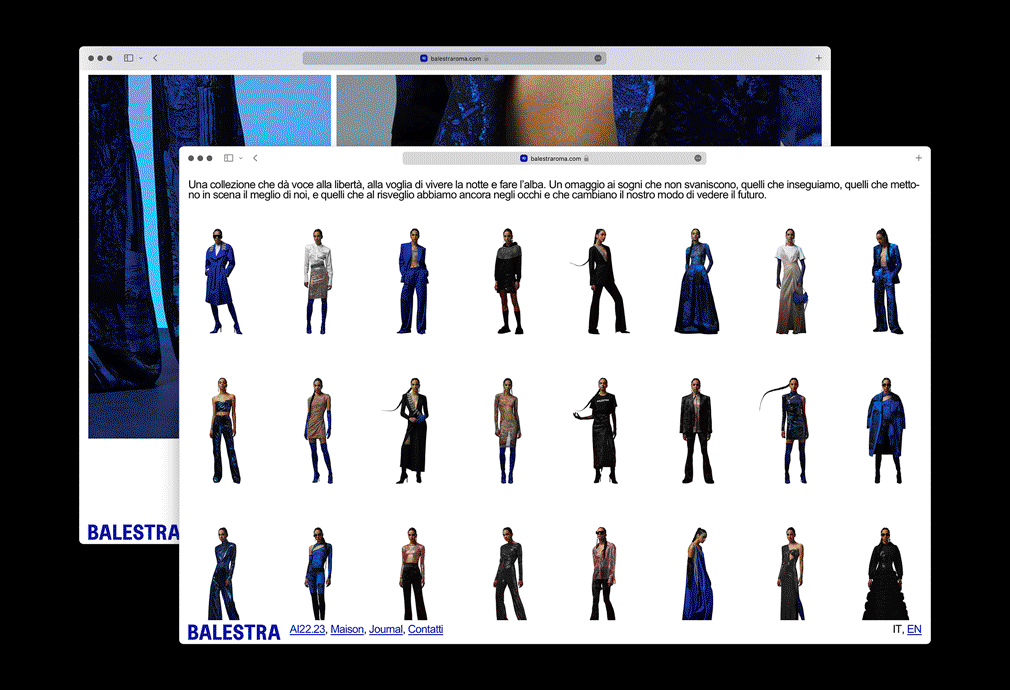
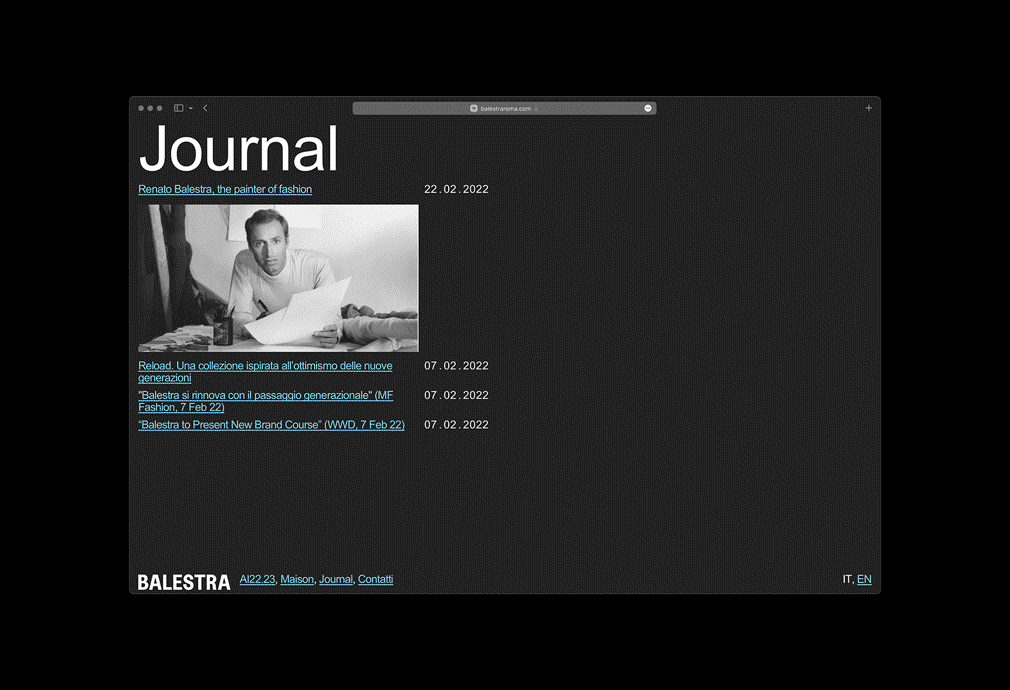
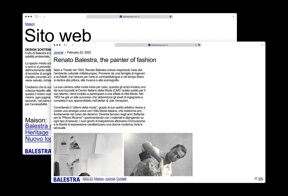
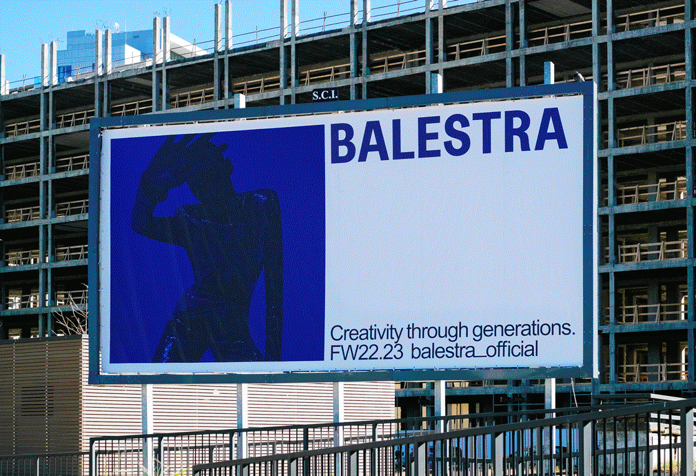
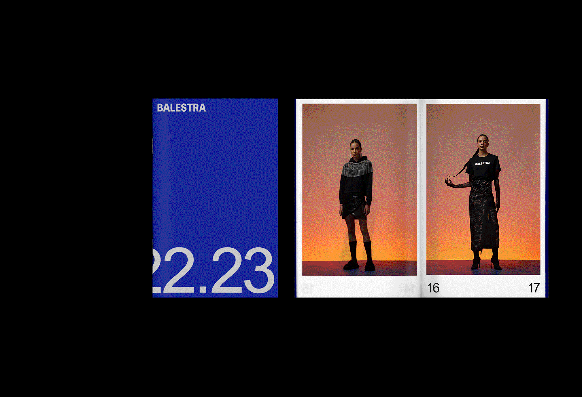
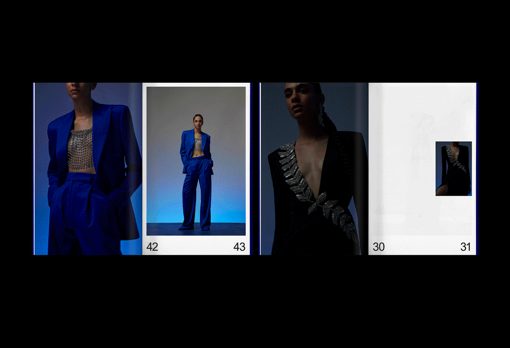
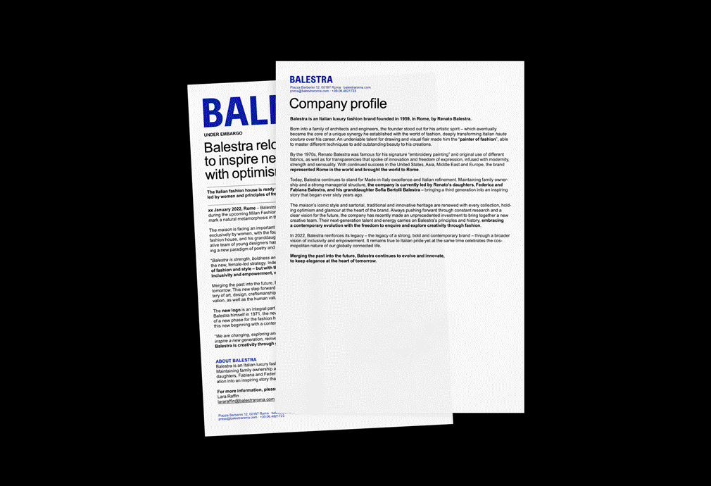
In line with the project for the website, other materials were developed in accordance with the same typographic solutions. In addition to the usual corporate graphics, consisting of letterheads, business cards, templates for presentations and catalogues, an advertising campaign in Milan during fashion week was created as well.
A deliberate attempt was made to move away from the repetitive paradigm of the white logo centered on a photo of a model, not because this does not work, but because it does not constitute a sufficient means of identification. Especially thinking about the poster in an environment of dozens of other fashion advertising campaigns which follow similar patterns. Devoting over 40% of the poster to white is a choice that does not go unnoticed.
The website is online at balestraroma.com.
Michelle Nebiolo (copywriting), Giacomo Mondino and Giorgia Florenzano worked on this project together with Norma.