Infographics
When dealing with a public looking for quick answers, our attention is much more focused towards writing a precise paragraph instead of imagining a story to contain it.
The diagram, a fundamental part of the infographic, represents the paragraph in question.
For us, a diagram is a communication tool. Sober, but able to deliver complex information quickly, offering multiple points of view transcending language barriers.
The mere presence of a diagram implies a sincere desire to inform. It represents an unwritten agreement between actor and public that promises to make data easier to understand. To obfuscate this task is to break the trust of the sender, as if expecting clear indications instead he would find hardly readable signs.

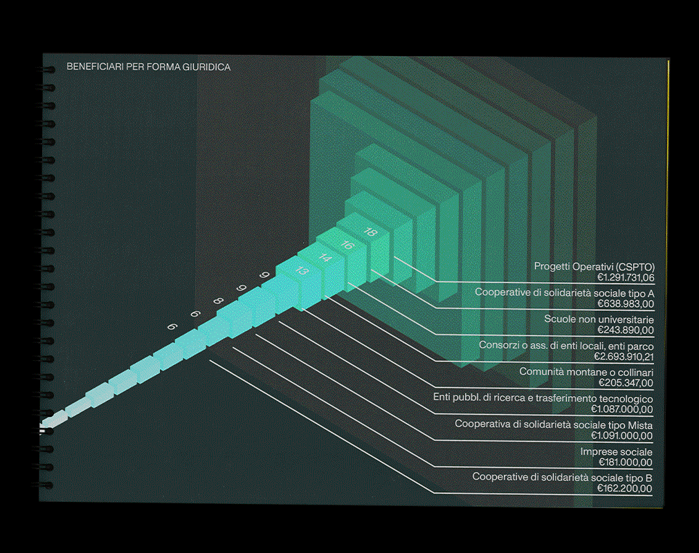
For each table we identified a point of view, so as to take advantage of the glance of the highest point to immediately give the most relevant information. This "editorial cut" distinguishes the diagram from the table.
Each graph was visualized as an isometric solid, arithmetically scaled with the data represented, using the colors of the Compagnia di San Paolo identity. Euclidean forms indicate quantitative properties of the data provided (eg number of euros invested), while more complex subjects are chosen in case of easily understandable qualitative properties (eg area of the provinces).
Accurate numerical indications on each entity complete the diagram.