Agnes Cecile: identity for artists
The white cube has been the preferred method to show art in museums for the last 80 years. The evolution of exhibition spaces has led to a solution which is difficult to leave today, above all because many objects acquire the art label only by being contained in a white cube.
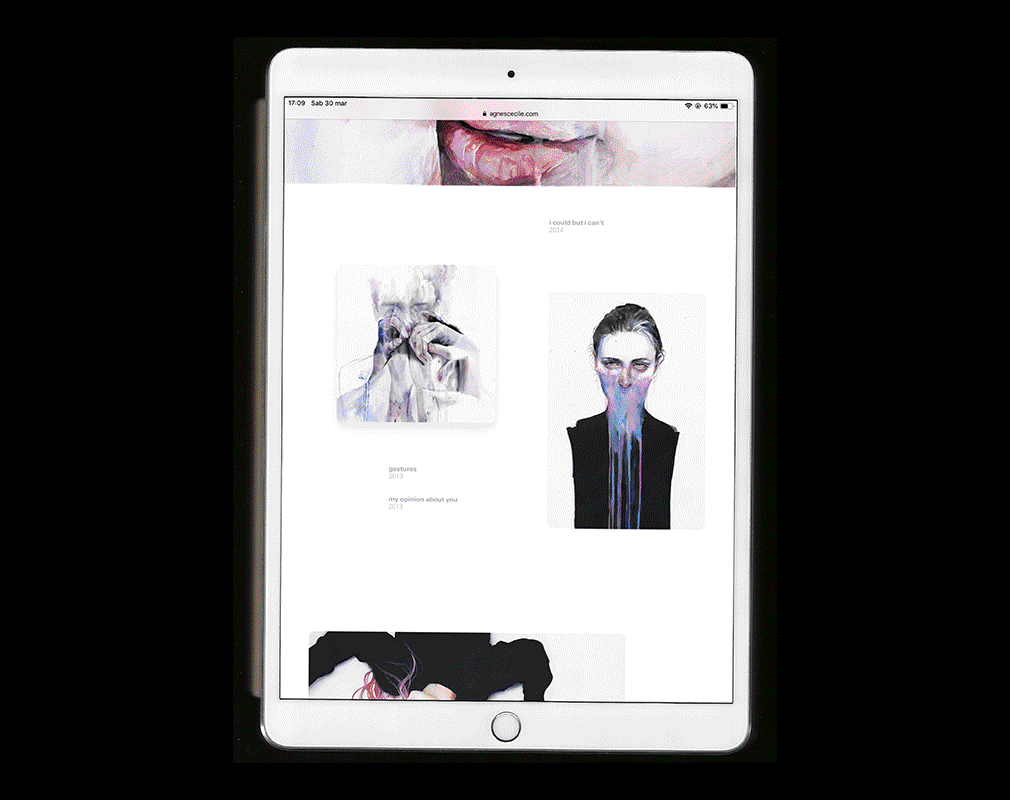
The Internet has reached a similar state: art galleries have become grids of small photographic previews on a white background. The detail of the work can be accessed with a click. The problem is shared among all the websites that need to display visual material: from design studios’ portfolios to video services.
“Right now, the conformity of artists’ websites is surprising considering the variety of artistic approaches, mediums, and styles in contemporary art.” writes Orit Gat in an article about the current state of the art on the Internet. “This is not reflected in artists’ websites: a small number of platforms such as Indexhibit and Cargo Collective are used by a large majority of artists when building their sites, responding to a checklist of unchanging components (CV, contact information, images). The consequence is that artists’ websites rarely do justice to their work.”
Similarly to the consolidated connection between the white cube and the legitimization of art, even the preview grid has become a recognizable signal for graphic and visual products. How to get out of it? How to give better value to the work?
The collaboration with Silvia Pelissero, an artist from Rome, for the development of a coordinated visual identity gave an opportunity to elaborate a new answer to this question.
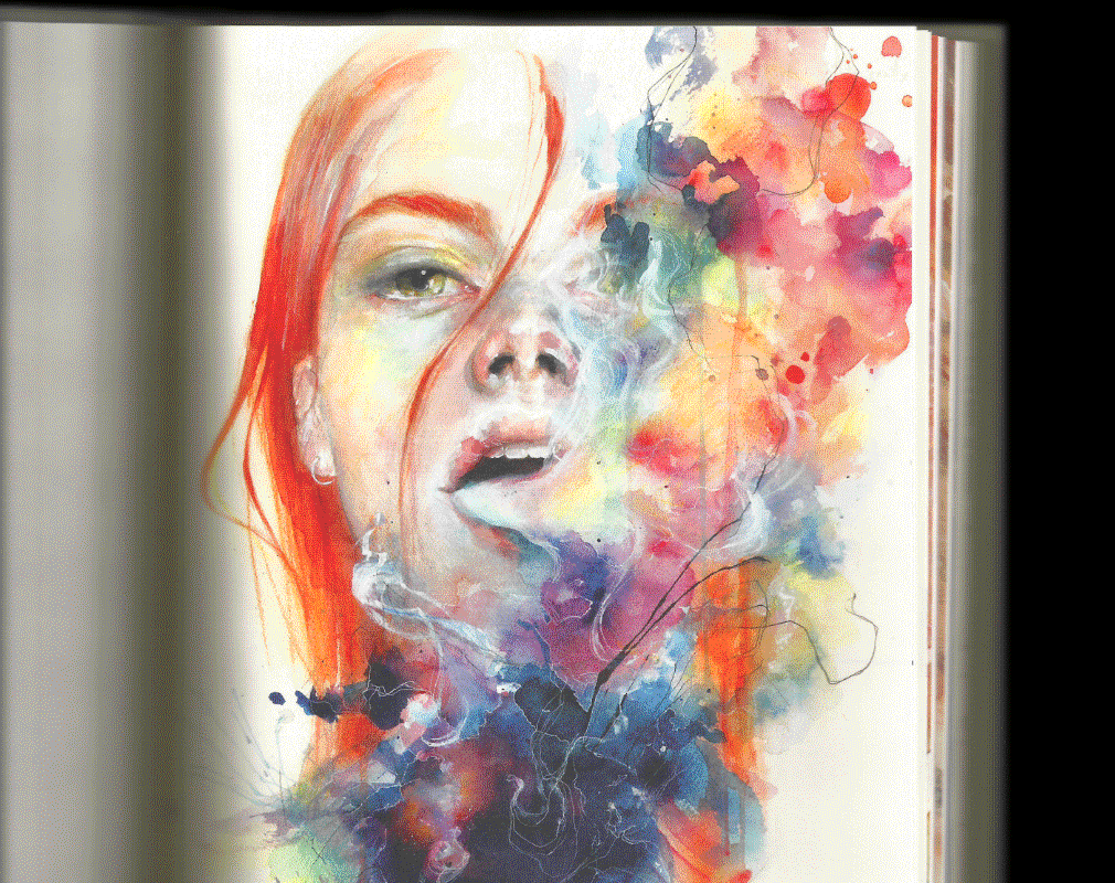
With the same curatorial approach to an exhibition, the paintings were selected and divided into themes, then arranged in a reasoned sequence. Once the screenplay for the exhibition was determined, variations in position and size were then introduced, as for a film, different shots make the scenes more dynamic. All adopted formats are generated by multiples of the same unit of measurement, so that they remain visually consistent. Finally, to accentuate the theme of the subjects that float in white, some figures are moved simulating a fluid while scrolling.
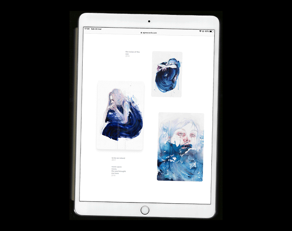
The whole page can be seen in a couple of minutes, there are no distractions or external links during the “visit”, you can only go forward or backward in the exhibition. This approach is diametrically opposed to the grids of previews, which instead offer a multiple choice, often ending up confusing the visitor who doesn’t know where to start.
The simple nature of the represented subject has given life to a project of similar formal cleanliness. Most importantly, before diving deep into details related to this particular project, we have wondered how to improve websites for artists in general. Link to the website: www.agnescecile.com.
Artbook
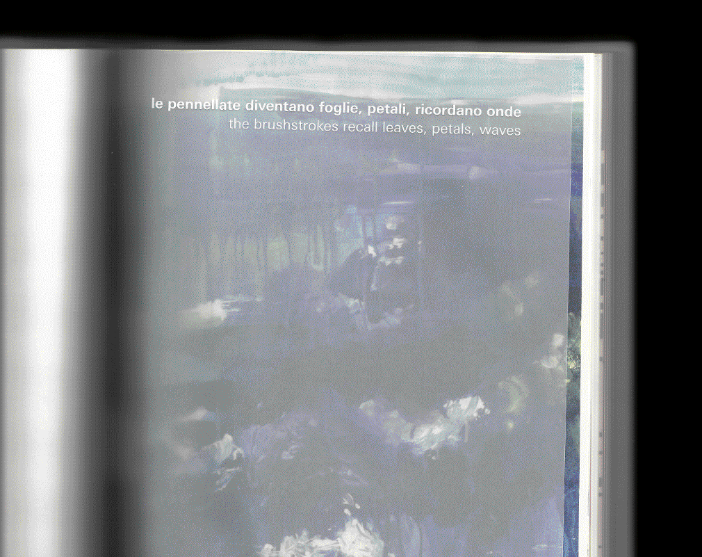
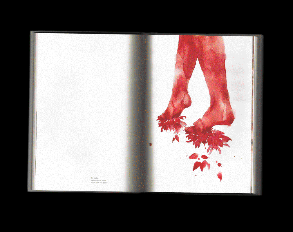
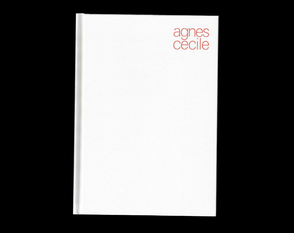
Agnes Cecile's first book has been designed with a similar interest in creating a dynamic experience. For example, to materialize the idea of transparencies, the title of each chapter has been screenprinted in white on a sheet of transparent paper that blurs a detail of a painting below it. Painting details open the book as well, like a series of close-up shots in the beginning of a movie before the narrator kicks in.
The book, a 17 x 24 cm hardback with 192 pages, was printed in Turin on Fedrigoni paper with a series of finishing touches and tricks to make it a collector's item for those who have been following Silvia for years. The book can be purchased on bigcartel.